<figure>
 Courtesy of Millimeter Interior Design
- Architects: Millimeter Interior Design
- Location: Silverstrand, Hong Kong
- Designer: Michael Liu
- Area: 300.0 m2
- Project Year: 2016
 Courtesy of Millimeter Interior Design
From the architect. Nestled in the mountain side, this house captures the spectacular ocean view of Silverstrand. The owners have been living there for over 15 years and knowing the shortcomings of the place, they were keen to transform the place into an innovative, yet, practical house to better suit their needs.
 Courtesy of Millimeter Interior Design
Built among the mountains, the original living room and dining room were separated by sublevels. The dining area in the upper part was the first area to see after entering the house, disturbing the practical flow. In addition, the original foyer lacked storage space, leaving the owners no choice but to place the shoe closet below the stairs. The uneven size of their children’s
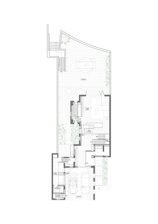
 Ground Floor Plan
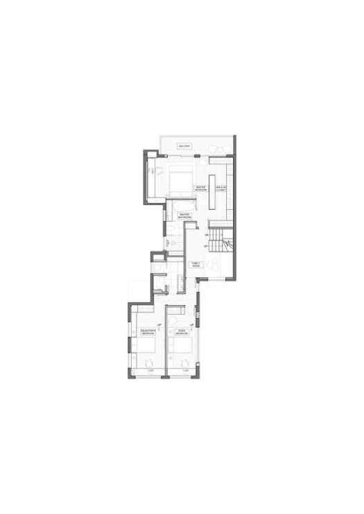
In order to improve the owner's living quality effectively, the designer carefully analyzed the original flow of the house and the owners’ habits and tailor-made a new flow for the owners, such as changing the location of the entrance, the area of the upper part and the staircases.
 Courtesy of Millimeter Interior Design
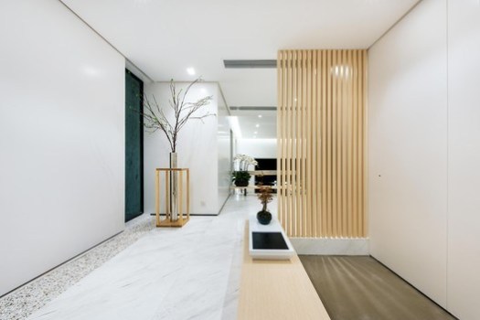
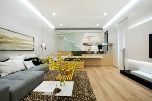
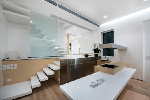
Moreover, since the owners seldom cook, designing a simple cooking space is sufficient. So the designer boldly demolished the original kitchen, re-positioned the entrance and added a foyer, so that visitors can gradually experience different spaces while entering the house. Meanwhile, a large space in the upper part on the ground floor was freed up, the designer merged that excess space with the lower part for an open kitchen. Even more interesting is that the designer found that by relocating the staircase, the redundant corridors in the second level can be removed, so that the utility rate of each room can be increased by around 20-45%. As the result, not only did it even out the sizes of the children's rooms, but also doubled the size of the walk-in closet in the master bedroom.
 Floor Plan
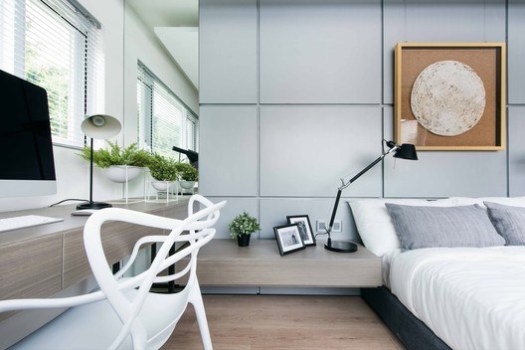
After implementing the structural adjustment, the designer applied simple yet sophisticated interiors design throughout the house by choosing light and pale materials as the main tone, creating a relaxed and serene feeling. Also, the structure line of the floating staircase, open kitchen countertops and benches work cohesively to create a sense of architectural aesthetics.
 Courtesy of Millimeter Interior Design
<img src="http://feeds.feedburner.com/~r/ArchDaily/~4/mIoMPGByzns" height="1" width="1" alt=""/>
