
 One of the most inspiring aspects of architecture is its constant evolution. Over time, new technologies push materials and their assemblies to new capabilities, while new ways of thinking introduce different geometries and relationships within design. Staying true to this process of evolution produces an architecture of the current time. And as we like to say, creating an architecture of the current time is authentic.
The unfortunate flip side to this equation is all of those architectural features that linger around are based on nothing but the nostalgia of the past. These are elements that have long been superseded by different and better ways of doing things, but they keep popping up like card-board cut-outs, offering a romanticized illusion of times past.
Today’s post calls out 10 architectural features that should have been taken out of rotation by now. These architecture features may have been useful at one time, and some of them should even be credited as important stepping stones, getting us to where we currently are in design. But by thoughtlessly sticking these features onto the sides of houses and buildings in this day and age, we’re not only fooling ourselves, but we’re pushing design backwards.*
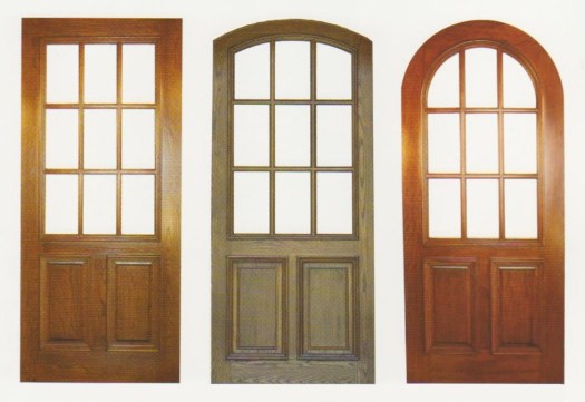
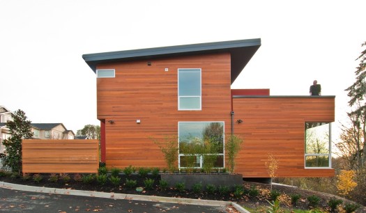
The Nine-Light Window or Door
One of the most inspiring aspects of architecture is its constant evolution. Over time, new technologies push materials and their assemblies to new capabilities, while new ways of thinking introduce different geometries and relationships within design. Staying true to this process of evolution produces an architecture of the current time. And as we like to say, creating an architecture of the current time is authentic.
The unfortunate flip side to this equation is all of those architectural features that linger around are based on nothing but the nostalgia of the past. These are elements that have long been superseded by different and better ways of doing things, but they keep popping up like card-board cut-outs, offering a romanticized illusion of times past.
Today’s post calls out 10 architectural features that should have been taken out of rotation by now. These architecture features may have been useful at one time, and some of them should even be credited as important stepping stones, getting us to where we currently are in design. But by thoughtlessly sticking these features onto the sides of houses and buildings in this day and age, we’re not only fooling ourselves, but we’re pushing design backwards.*
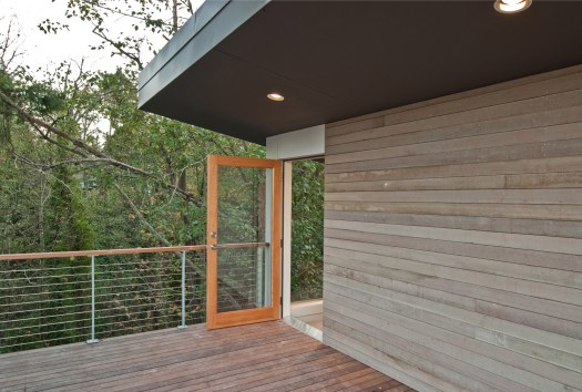
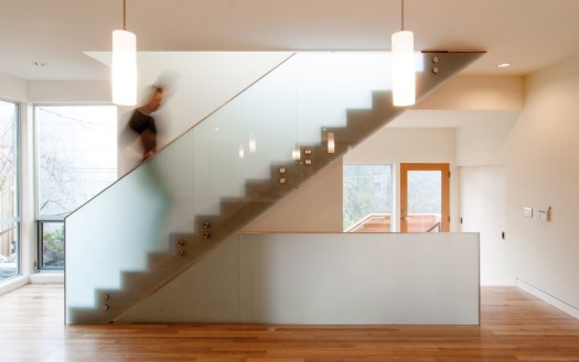
The Nine-Light Window or DoorThe most ironic thing about nine-light windows and doors is that the aesthetic wasn’t even desired when it was originally developed. The small glass panels were simply a product of the technological limitations at the time. Today, conventional residential double-pane glass panels can easily be produced in sheets of 50 square feet (and larger for custom applications). In fact, the limitations of window sizes today are more typically governed by the gravity and lateral forces acting on the glass, rather than the technology of manufacturing glass. Adding insult to injury, many off-the-shelf nine-light applications are actually two large pieces of glass with 4 plastic runners in between creating a geometrical illusion of nine separate panes of glass. Uhgo.
 The Half-Timber Infill
Way back in Medieval Europe, when tall and straight trees became scarce, architects and builders turned to smaller, scrawnier trees to frame the exterior walls of a structure. This produced the classic Tudor look with the stick framing enhanced by its white stucco counterpart filling in the cavities between wood members. Where do we even start with this one? Never mind the abundance of tall straight trees in regions like the Pacific Northwest, this aesthetic is entirely irrelevant to every aspect of construction in the modern world. Today, the entire half-timber visual is stuck onto conventionally framed walls made out of 2x6s and plywood. It is, quite literally, exterior wallpaper. Wallpaper that screams, “I live in the dark ages! But only superficially.”
 The Knee Brace
Knee braces made a name for themselves in the early 1900’s within the craftsman style and were even considered embellishments at that time. Modern day framing has long since replaced the need for exterior mounted supports at roof eaves and a decent structural engineer can design a roof system that avoids knee braces in their sleep. Oddly enough, these “supports” are often one of the first exterior elements of a house in need of replacement.
 The Decorative Shutter
The worst thing about the decorative shutter is that, well … it doesn’t shut. These ornamental panels are typically mounted to the exterior walls on either side of the windows permanently. Our favorite version of the inoperable shutter is when the sizes of the shutters don’t even correlate to the window itself. Stunning!
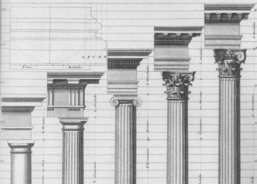
 The Doric, Ionic, Corinthian, and Composite Column Orders
The Greeks invented the Doric order and Ionic order (known for the volutes of its capital) in the Archaic Period between 750 and 480 BC. Around 430 BC, the Greek city-state of Corinth produced its namesake order which was modeled after the acanthus leaf. Much later, the Romans designed the Composite order which combines elements from the Ionic and Corinthian orders and first appeared in 82 AD. The point is this, the Greek and Roman orders have twenty-five hundred years of architectural history embedded in their DNA. Don’t tack these onto the side of your 1980’s ranch style house. Just don’t.
 The Double-Hung Window
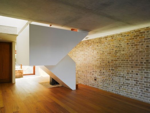
Made from one part romance and two parts impracticality, this historic window type relies on counter-weights at each side of the window buried within the walls. Lighter, modern day versions have eliminated the counter-weights but always seem to retain the awkward mechanics of actually opening the window typically caused by the window racking as it attempts to battle gravity. For an authentic application of this window, we recommend globbing on numerous coats of paint to further inconvenience the user. Bonus points for combining the double-hung window with the nine-light window.
 The Gambrel Roof and Mansard Roof
Both the Gambrel and Mansard roof geometries were originally designed as strategies to balance the facades of large, stately buildings into an appropriately proportioned base, middle and cap. And when applied to the Chateau de Fontainebleau, this approach produces a monumental example of historic architecture. When applied to the American single family residence, however, it not only fails to create visual harmony, but it devastates the structure’s scale.
 The Mini-Dormer and Eyebrow
The mini-dormer or eyebrow window is a clear sign of architectural denial. The house wants to have a second story but doesn’t want to admit it to the world. The inhabitants pay the price for this condition by having to twist their necks and angle their heads just to use the bathroom mirror. Worse yet, design denial is only the first stage in mourning the loss of functional architecture, followed by anger, bargaining, depression, and finally, acceptance.
 Quoins
Originally, these corner blocks were made from solid stone and were visually enhanced at the corners of a building, suggesting that your great-grandfather hauled them by wagon and heaved them into place by hand. Modern day examples are applied like peel-n-stick styrofoam and are often painted a different color to “create an impression of permanence and strength, and reinforce the onlooker’s sense of a structure’s presence” (thanks Wikipedia). Great-grandpa would be proud.
 The Palladian Window
Praising the modern-day Palladian window is, without a doubt, the swiftest and most reliable way to piss-off your contemporary design friends. Not only is it the most adulterated architectural element in western civilization, but it’s typically used in conjunction with a hodge-podge of items from the list above. Don’t get us wrong, there’s nothing architecturally unethical about traditional examples of this window configuration. Italian examples dating from the late 1400’s remain pure expressions of Palladianism with their central semicircular arched window centered between two rectangular geometries. But installing spring-loaded vinyl roller shades behind a double-hung, nine-light Palladian window, flanked by ill proportioned shutters would have caused Andrea Palladio to launch his pasta across the room.
- There’s an important disclaimer to mention involving historic restoration, which we support. Just as the architecture of today should be authentic to the present time, architectures of the past should be authentic to theirs. Restoring and/or preserving traditional buildings may very well require the use of many of the architectural elements in this list and if it helps respect and maintain these architectures, we’re all for it.


 As much as we love our
  We sat down and started the project
  THERE’S NO SUCH THING AS A BLANK CANVAS IN ARCHITECTURE
 But just because the existing home will be demolished, doesn’t mean that it doesn’t play a role in the process. An artist friend of ours,
  As important as shearwalls are to architecture, it’s surprising how unappreciated they remain in the design process of most homes. Moreover, it’s always discouraging to realize how few people (and sometimes even architects!) understand the mechanics behind shearwalls. For the amount of work shearwalls do, they get very little time in the spotlight of design conversation, in fact they’re usually only mentioned as a byproduct of where the windows can and cannot be located. We can’t help but think that this is a bit of an insult to shearwalls, as they do have their own
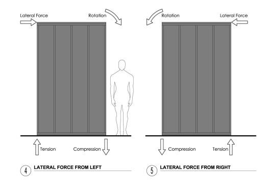
 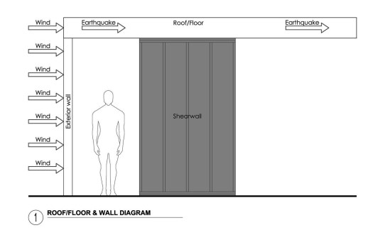 Getting the lateral force from the exterior walls to the roof or floor and into the shearwall is only one step in the sequence, though. Once the forces are distributed to the shearwall, the integrity of the shearwall itself becomes an important factor. The diagram below to the left shows how a shearwall resolves the applicable lateral forces applied to it. The connections between the framing (2x4s or 2x6s) and the sheathing (plywood) creates a wall member that works as one element (think of it like a big wood block).
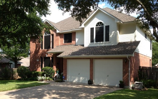
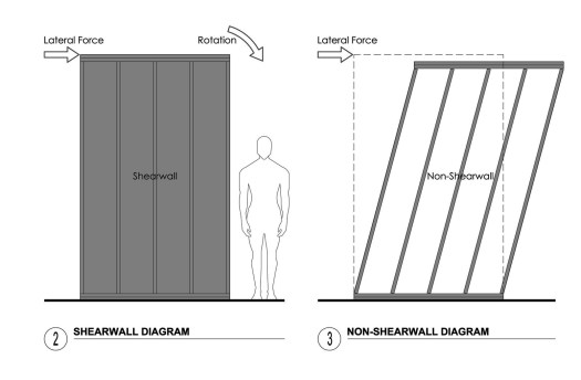 Without the sheathing, the wall fails to act as one member and the individual connections between framing members fail under the same lateral forces as in the diagram above to the right. When the shearwalls of a project are inadequate (or absent) and cannot resolve the load of the shifting weight above due to lateral forces, it can result in something like the image below. Garage doors, as it turns out, are not recommended in lieu of shearwalls.
 Wood has its limitations as far as shearwalls are concerned and there are certainly other solutions, but they come at an expense.
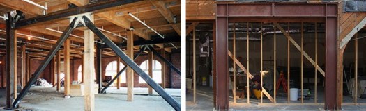
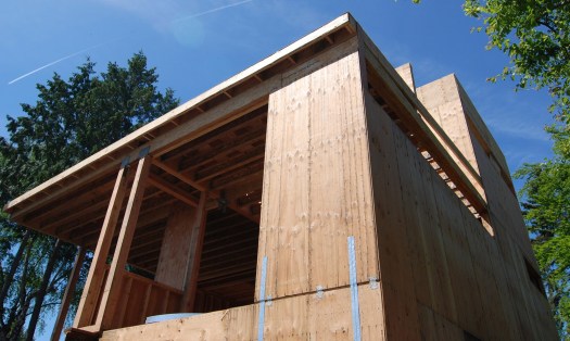
 Compression forces in the shearwall assembly are resisted through columns (or studs in wood framing speak); multiple 2x4s or 2x6s typically satisfy most situations, 4x4s or 4x6s can be used for larger compression forces, and the occasional steel post is used for excessive conditions. If these posts sit on the foundation, they transfer the force directly into the concrete. If they sit on a wood framed floor, the load is transferred to the next floor down and resolved in a similar way until the force reaches the foundation. The photo below shows a very hard working shearwall with (8) 2×6 studs at the edge to resist the compression forces (in addition to picking up the gravity load of the beam above).
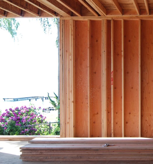 Because wood framing is poor at resisting tension forces, significant tension forces in a shearwall are typically resisted by steel straps between the shearwall and the floor or foundation below. The photo (below) shows a shearwall on the left side of the house with (2) sets of Simpson CS16 straps on each side of the shearwall to transfer the tension forces to the wall underneath.
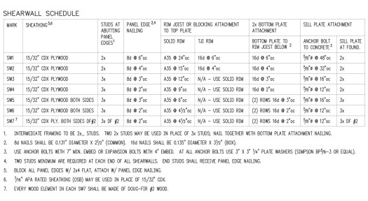
 Most construction drawing sets include a shearwall schedule which indentifies the attachment specifications of several different shearwalls. The higher the shearwall’s number (SW1, SW2, SW3 …), the more lateral force it can resolve. This particular schedule goes all the way up to a SW7 — keep in mind that anything above a SW5 requires sheathing on both sides of the framing. This schedule calls out the attachment of sheathing to framing as well as the attachment of the wall on top and bottom.
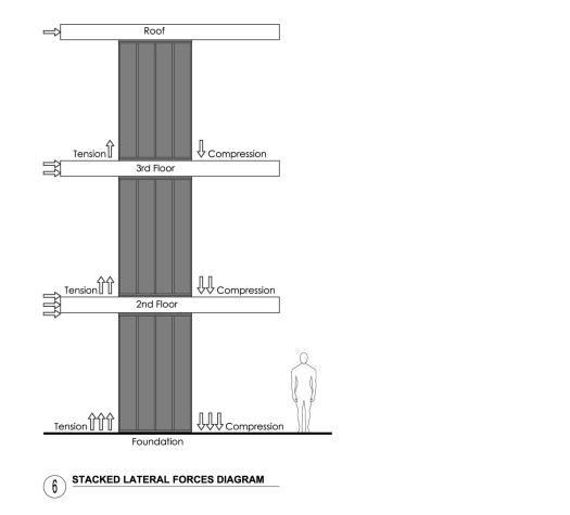
 On multi-story structures, the forces from upper floors collect and add their forces to the lower floors all the way down through the structure. The lower floors must then resolve their own forces and the forces generated from above as outlined in this diagram.
 It should be apparent by now that there are numerous variables in the design, calculations, and construction of shearwalls. One tweak to the equation (like changing the width of a shearwall) creates a ripple effect and can change the requirements of other factors. Perhaps the single most successful strategy to deal with these variables is having a good relationship with an experienced structural engineer. A skillful structural engineer can design shearwalls that are effective and attenuated, leaving as much space as possible for doors and windows. For bonus points, an architect that understands the logic of structural engineering allows for clear communication and an effective design process.
So to summarize; no you can’t have a full window wall where you need to transfer lateral forces from the roof down to the foundation — without throwing bags of money at it. But if you approach the design process intelligently and respect the structural engineering, the shearwalls can most likely be smaller and smarter. Most importantly, don’t mess with mother nature — she cares less about your windows than you might think.
Cheers from Team BUILD
It should be apparent by now that there are numerous variables in the design, calculations, and construction of shearwalls. One tweak to the equation (like changing the width of a shearwall) creates a ripple effect and can change the requirements of other factors. Perhaps the single most successful strategy to deal with these variables is having a good relationship with an experienced structural engineer. A skillful structural engineer can design shearwalls that are effective and attenuated, leaving as much space as possible for doors and windows. For bonus points, an architect that understands the logic of structural engineering allows for clear communication and an effective design process.
So to summarize; no you can’t have a full window wall where you need to transfer lateral forces from the roof down to the foundation — without throwing bags of money at it. But if you approach the design process intelligently and respect the structural engineering, the shearwalls can most likely be smaller and smarter. Most importantly, don’t mess with mother nature — she cares less about your windows than you might think.
Cheers from Team BUILD

 As architects, we think of ourselves as a pretty thoughtful and progressive group. We like to think that we leave things better than we find them. And, although we are in an industry and region with pretty inflated financial barriers to entry, we maintain a disciplined and responsible approach to spending the hard-earned funds our clients trust us with. Thrifty isn’t necessarily the word for it, but we provide great value for the time, energy, and dollars entrusted to us.
A friend once told us, “Liberalism is wonderful as long as you don’t mind paying for it.” We believe that paying a fair share of taxes and “user fees” (a ubiquitous term now used to cover everything from supporting state parks to applying for building permits and then some) is the bedrock parameter for maintaining a civil society and a community we’ll continue living in. This philosophy makes common sense to us and we don’t at all mind paying to fix potholes, uphold life safety in the built environment, keep city pools open, and allow some element of access to community for everyone. You know, the basic covenants America was based on.
But lately, we’ve noticed something very disturbing, and it’s become an increasingly troubling pattern. At a time when our industry is finally rebounding from the recession, we see a new threat on the horizon — a bureaucratic embellishment of sorts, along with “user fees” that have tipped to unprecedented and unbalanced levels. Here are our own personal, first-hand, real-world experiences indicating that things have tipped:
Excessive fees by regulatory groups
As architects, we think of ourselves as a pretty thoughtful and progressive group. We like to think that we leave things better than we find them. And, although we are in an industry and region with pretty inflated financial barriers to entry, we maintain a disciplined and responsible approach to spending the hard-earned funds our clients trust us with. Thrifty isn’t necessarily the word for it, but we provide great value for the time, energy, and dollars entrusted to us.
A friend once told us, “Liberalism is wonderful as long as you don’t mind paying for it.” We believe that paying a fair share of taxes and “user fees” (a ubiquitous term now used to cover everything from supporting state parks to applying for building permits and then some) is the bedrock parameter for maintaining a civil society and a community we’ll continue living in. This philosophy makes common sense to us and we don’t at all mind paying to fix potholes, uphold life safety in the built environment, keep city pools open, and allow some element of access to community for everyone. You know, the basic covenants America was based on.
But lately, we’ve noticed something very disturbing, and it’s become an increasingly troubling pattern. At a time when our industry is finally rebounding from the recession, we see a new threat on the horizon — a bureaucratic embellishment of sorts, along with “user fees” that have tipped to unprecedented and unbalanced levels. Here are our own personal, first-hand, real-world experiences indicating that things have tipped:
Excessive fees by regulatory groups Overreach by third party inspectors
 Architects are becoming Permit Technicians
 We like meeting (and exceeding) the requirements of the building code. We like designing buildings that are environmentally responsible, structurally sound, and safe for the inhabitants. But the amount of time required to satisfy the permit review process is becoming excessive to the point that it’s jeopardizing doing good architecture.
We know what you’re thinking: Meeting the building code and designing the building should be one in the same. And we couldn’t agree more. However, the permit submittal process is quickly evolving into a set of documents that serve the bureaucratic process alone, mutually exclusive of the construction documents. A few examples include drainage calculations that become mathematically abstract, impractical temporary site provisions (wrapping the trees in plywood for protection, really?!), and unrealistic furnace specifications intended to address policy rather than the reality of heating a home. Many of these requirements become mere exercises in checking boxes, reverse engineering, or worse: gaming the system to produce the desired results. All of this competes with the bandwidth required of the more significant and tangible aspects of architecture, like the nuts and bolts of the structural system, coordinating with the manufacturers for the most appropriate products, and creating a piece of architecture that will be a value add to the built environment. Not to mention, actually focusing on making a project more sensible, sustainable, and low impact. Architects are becoming permit technicians at the expense of doing good architecture.
Overlapping Liability
We like meeting (and exceeding) the requirements of the building code. We like designing buildings that are environmentally responsible, structurally sound, and safe for the inhabitants. But the amount of time required to satisfy the permit review process is becoming excessive to the point that it’s jeopardizing doing good architecture.
We know what you’re thinking: Meeting the building code and designing the building should be one in the same. And we couldn’t agree more. However, the permit submittal process is quickly evolving into a set of documents that serve the bureaucratic process alone, mutually exclusive of the construction documents. A few examples include drainage calculations that become mathematically abstract, impractical temporary site provisions (wrapping the trees in plywood for protection, really?!), and unrealistic furnace specifications intended to address policy rather than the reality of heating a home. Many of these requirements become mere exercises in checking boxes, reverse engineering, or worse: gaming the system to produce the desired results. All of this competes with the bandwidth required of the more significant and tangible aspects of architecture, like the nuts and bolts of the structural system, coordinating with the manufacturers for the most appropriate products, and creating a piece of architecture that will be a value add to the built environment. Not to mention, actually focusing on making a project more sensible, sustainable, and low impact. Architects are becoming permit technicians at the expense of doing good architecture.
Overlapping Liability The way we see it, the excessive fees and disproportionate time required of the permitting and inspection phases of a project are clear indicators that the needle of the sensibility-o-meter is red-lining. The system has tipped into a dangerous zone, and not only has the process become inefficient, it’s become wasteful. A clear vision of the seas we’re all trying to navigate is becoming obstructed by the tidal wave of hyper-regulation. It’s situations like this that paralyze communities, cities and societies, and if you ask us, it’s time to sound the alarm bell. Most of us (architects, builders, trades-people, plan reviewers, inspectors) want to do work we’re proud of, work that is environmentally responsible, work that makes the built-environment better, work that gets us excited when we hop out of bed in the morning. There are no enemies here — we’re all after the same goal — but we need to work more intelligently, resourcefully, sensibly, and with more accountability.
 As always, we’re open to your thoughts.
Cheers from Team BUILD
As always, we’re open to your thoughts.
Cheers from Team BUILD

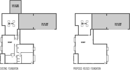 THE EXISTING FOUNDATION TO REMAIN is equal to the amount of concrete that will not be going to the landfill or the recycling facility; it adds up to 2,035 cubic feet (75.4 cubic yards) or 226,200 lbs (113.1 tons) of concrete. This number includes all of the concrete within the footprint of the home (footings, retaining walls, and slabs on grade).
Not trucking this material to the landfill or recycling station saves an estimated 56 gallons of fuel and eliminates a dump truck on the roads for 8 round-trips totaling 384 miles. The elimination of an excavator on site saves an estimated 100 gallons of fuel.
THE EXISTING FOUNDATION TO BE DEMOLISHED results in 96 cubic feet (5.8 cubic yards) or 17,400 lbs (8.7 tons) of concrete and is equivalent to one dump truck load. This will likely be crushed and reused on site as fill for the proposed landscaping.
THE NEW FOUNDATION THAT WON’T BE NECESSARY (even if it were constructed in the exact footprint of the existing house) would consume more concrete and steel than the existing foundation, simply because today’s building codes and standards are a bit more stringent. The concrete required to build a new house of the same footprint would consume 2,265 cubic feet (83.9 cubic yards) or 251,700 lbs (125.9 tons) of concrete. This concrete work would require 13.4 cubic feet of reinforcing steel.
The trucking required of this foundation would require an estimated 21 gallons of fuel with the concrete mixer on the roads for 9 round-trips totaling 100 miles. Once you factor in waiting times, concrete pumping, delivering the reinforcing, etc., the fuel amount would most likely be doubled.
THE TOTALS of reusing the existing foundation eliminates over 226,000 lbs of concrete from entering the landfill or recycling facility, it prevents 2,265 cubic feet of concrete and 13.4 cubic feet of steel from being produced/used and saves approximately 200 gallons of fuel, and this is just for the actual material conveyance and placement (more on the other carbon impacts in a moment).
Obviously there are some variables involved in this calculation, such as distances to the concrete/landfill/recycling facilities, type of machinery being used, and the efficiency of work on site. But even with a healthy margin of error, these are big numbers for a single family residence.
THE LIMITATIONS of our math here are obvious. For instance we don’t address the resources/fuel it would take to put the crushed and recycled concrete back into use once it’s been delivered to the recycling facility. The resources required to produce the new concrete and steel for a new foundation also aren’t addressed. It would be an interesting study to follow the thread further and determine the carbon footprint of reusing the foundation as opposed to demolishing and existing foundation and pouring a new one. But not only is that math a bit beyond our expertise, we’ve got a house to continue designing here. The bottom line is that these fully developed numbers would simply reinforce (pun intended) the environmental significance of keeping an existing foundation.
THE COST of all this is perhaps the most important clincher. All of this material and fuel is eliminated, reduced, reused and recycled for the minimal cost of the design team sharpening their pencils and figuring out an elegant and strategic method to reuse a perfectly good foundation. There’s no proprietary technology to acquire, no ironic “green” home gadget to buy, and no esoteric information to decipher. Any design and construction team can do this.
THE DISCLAIMER of this method of sustainable design is both encouraging and maybe a bit depressing for some readers. As beneficial to the environment (and frankly, to a project’s target budget and schedule) as reusing a foundation is, it’s never going to sound all that stimulating at a dinner party. The conversation will likely be trumped with talk of “sexier” technologies: solar panels, geothermal heating, gray-water collection tanks, what have you. And while all of these sustainable and “green” technologies have their merits, none beats the energy spent vs. value gained equation of simply reusing an existing foundation.
THE POINT of all this was to take our best crack at the sustainability metrics of reusing an existing foundation for a typical residential project. As we suspected, the numbers are substantial and the environmental savings is significant. It is most certainly worth the bit of extra design and coordination time to implement. True sustainability typically
THE EXISTING FOUNDATION TO REMAIN is equal to the amount of concrete that will not be going to the landfill or the recycling facility; it adds up to 2,035 cubic feet (75.4 cubic yards) or 226,200 lbs (113.1 tons) of concrete. This number includes all of the concrete within the footprint of the home (footings, retaining walls, and slabs on grade).
Not trucking this material to the landfill or recycling station saves an estimated 56 gallons of fuel and eliminates a dump truck on the roads for 8 round-trips totaling 384 miles. The elimination of an excavator on site saves an estimated 100 gallons of fuel.
THE EXISTING FOUNDATION TO BE DEMOLISHED results in 96 cubic feet (5.8 cubic yards) or 17,400 lbs (8.7 tons) of concrete and is equivalent to one dump truck load. This will likely be crushed and reused on site as fill for the proposed landscaping.
THE NEW FOUNDATION THAT WON’T BE NECESSARY (even if it were constructed in the exact footprint of the existing house) would consume more concrete and steel than the existing foundation, simply because today’s building codes and standards are a bit more stringent. The concrete required to build a new house of the same footprint would consume 2,265 cubic feet (83.9 cubic yards) or 251,700 lbs (125.9 tons) of concrete. This concrete work would require 13.4 cubic feet of reinforcing steel.
The trucking required of this foundation would require an estimated 21 gallons of fuel with the concrete mixer on the roads for 9 round-trips totaling 100 miles. Once you factor in waiting times, concrete pumping, delivering the reinforcing, etc., the fuel amount would most likely be doubled.
THE TOTALS of reusing the existing foundation eliminates over 226,000 lbs of concrete from entering the landfill or recycling facility, it prevents 2,265 cubic feet of concrete and 13.4 cubic feet of steel from being produced/used and saves approximately 200 gallons of fuel, and this is just for the actual material conveyance and placement (more on the other carbon impacts in a moment).
Obviously there are some variables involved in this calculation, such as distances to the concrete/landfill/recycling facilities, type of machinery being used, and the efficiency of work on site. But even with a healthy margin of error, these are big numbers for a single family residence.
THE LIMITATIONS of our math here are obvious. For instance we don’t address the resources/fuel it would take to put the crushed and recycled concrete back into use once it’s been delivered to the recycling facility. The resources required to produce the new concrete and steel for a new foundation also aren’t addressed. It would be an interesting study to follow the thread further and determine the carbon footprint of reusing the foundation as opposed to demolishing and existing foundation and pouring a new one. But not only is that math a bit beyond our expertise, we’ve got a house to continue designing here. The bottom line is that these fully developed numbers would simply reinforce (pun intended) the environmental significance of keeping an existing foundation.
THE COST of all this is perhaps the most important clincher. All of this material and fuel is eliminated, reduced, reused and recycled for the minimal cost of the design team sharpening their pencils and figuring out an elegant and strategic method to reuse a perfectly good foundation. There’s no proprietary technology to acquire, no ironic “green” home gadget to buy, and no esoteric information to decipher. Any design and construction team can do this.
THE DISCLAIMER of this method of sustainable design is both encouraging and maybe a bit depressing for some readers. As beneficial to the environment (and frankly, to a project’s target budget and schedule) as reusing a foundation is, it’s never going to sound all that stimulating at a dinner party. The conversation will likely be trumped with talk of “sexier” technologies: solar panels, geothermal heating, gray-water collection tanks, what have you. And while all of these sustainable and “green” technologies have their merits, none beats the energy spent vs. value gained equation of simply reusing an existing foundation.
THE POINT of all this was to take our best crack at the sustainability metrics of reusing an existing foundation for a typical residential project. As we suspected, the numbers are substantial and the environmental savings is significant. It is most certainly worth the bit of extra design and coordination time to implement. True sustainability typically  Keep both feet on the ground and cheers from Team BUILD.


 If it is the former, barring any impacts on the resale value of your home, you can “get away” with spending far less on a more than adequate range or cooktop/wall oven. Most people that we talk to in the showroom are somewhere in the middle; usually wanting to cook for enjoyment but haven’t really got the time. Features that ten years ago were only available in professional level appliances (i.e. low simmer, high output burners, convection ovens) are now included in much more affordable options. The quality, effectiveness, and durability of those options compared to their professional versions varies. Occasionally, you’ll gain more functionality in considering non-professional options (like the pictured 30” GE PGS950SEFSS Double Oven Gas Convection Slide-in Range). It is worth mentioning that these extra features can potentially expose you to a greater likelihood of requiring service down the road.


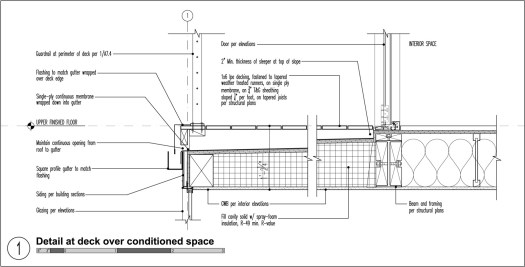


 The ceiling drop can be further concealed with the use of a soffit if desired -here’s our
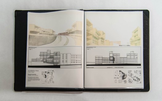
  Each spring we receive an abundance of architectural portfolios, supplemented with resumés, from students eager to secure a summer internship. These portfolios come from all over the world and exhibit a wide range of abilities and design philosophies. While we always enjoy seeing the diversity of design and presentation skills offered by the future architects of the world, diversity isn’t actually what makes the greatest impact when we review a portfolio. The funny thing is, the more variety we see with the presentation of portfolios, the more we rely on a simple and consistent set of guidelines to determine a candidate’s aptitude. These guidelines are timeless, they relate to our own student portfolios (pre-Photoshop) just as they do to today’s highly digitized portfolios. They span all mediums and pertain to physical and digital portfolios alike. They are universal and apply equally from Arkansas to Zimbabwe, and from the university level to professional internships.
This is typically the part where we’d tell you that this is just our perspective and that you should take it with a grain of salt; that if you get 10 architects in a room, you’ll get 11 perspectives and so on. But that’s not really the case with this particular topic. The 5 guidelines below were gleaned from our experiences in undergraduate school, graduate school, working for architects and, eventually, running our own shop. Some of these guidelines were handed down to us by the individuals that decide whether or not you’ll get into the graduate school of your preference, others are the convictions of the architectural collective mind. At the very least, every architecture student should consider these 5 guidelines when preparing their portfolio.
Each spring we receive an abundance of architectural portfolios, supplemented with resumés, from students eager to secure a summer internship. These portfolios come from all over the world and exhibit a wide range of abilities and design philosophies. While we always enjoy seeing the diversity of design and presentation skills offered by the future architects of the world, diversity isn’t actually what makes the greatest impact when we review a portfolio. The funny thing is, the more variety we see with the presentation of portfolios, the more we rely on a simple and consistent set of guidelines to determine a candidate’s aptitude. These guidelines are timeless, they relate to our own student portfolios (pre-Photoshop) just as they do to today’s highly digitized portfolios. They span all mediums and pertain to physical and digital portfolios alike. They are universal and apply equally from Arkansas to Zimbabwe, and from the university level to professional internships.
This is typically the part where we’d tell you that this is just our perspective and that you should take it with a grain of salt; that if you get 10 architects in a room, you’ll get 11 perspectives and so on. But that’s not really the case with this particular topic. The 5 guidelines below were gleaned from our experiences in undergraduate school, graduate school, working for architects and, eventually, running our own shop. Some of these guidelines were handed down to us by the individuals that decide whether or not you’ll get into the graduate school of your preference, others are the convictions of the architectural collective mind. At the very least, every architecture student should consider these 5 guidelines when preparing their portfolio.
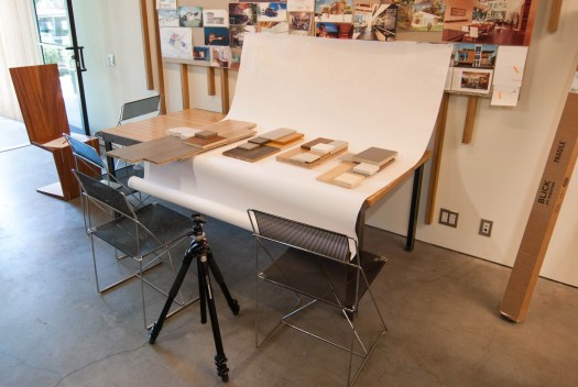
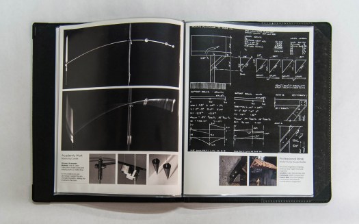
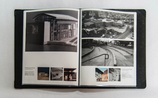
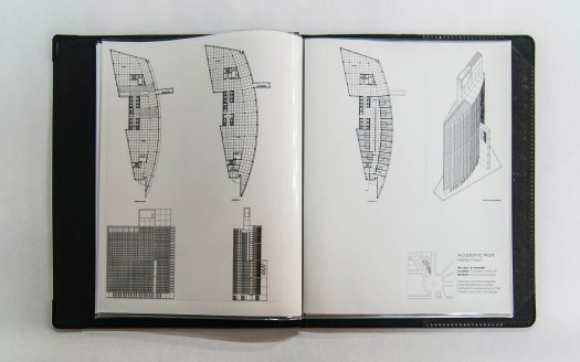 The visuals for this post were pulled from one of our own portfolios, and although this example is practically ancient now (it was completed when camera’s still used film!) it serves the conversation well. The same guidelines applied to this portfolio just as they do with the portfolios we get every day, hot off the press.
1. Don’t overthink the packaging. Whether it’s the binding form-factor for a physical portfolio or the choice of presentation templates for an online portfolio, simple and straight-forward is typically more effective than overly creative attempts. If you’ve got a clever idea, by all means, use it, but don’t concoct something just for the sake of being different at the expense of clarity and accuracy. Remember, it’s the work inside the portfolio that is the focus, the binder or website is simply the vehicle.
For physical portfolios, there’s nothing that beats the attenuation of the plain and simple
The visuals for this post were pulled from one of our own portfolios, and although this example is practically ancient now (it was completed when camera’s still used film!) it serves the conversation well. The same guidelines applied to this portfolio just as they do with the portfolios we get every day, hot off the press.
1. Don’t overthink the packaging. Whether it’s the binding form-factor for a physical portfolio or the choice of presentation templates for an online portfolio, simple and straight-forward is typically more effective than overly creative attempts. If you’ve got a clever idea, by all means, use it, but don’t concoct something just for the sake of being different at the expense of clarity and accuracy. Remember, it’s the work inside the portfolio that is the focus, the binder or website is simply the vehicle.
For physical portfolios, there’s nothing that beats the attenuation of the plain and simple 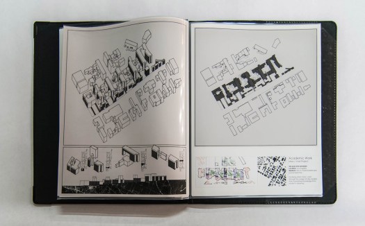 2. The Rule of Thirds. A portfolio is the summary of your life’s design accomplishments, it should show the best examples from three primary aspects of your architectural endeavors:
1/3rd ACADEMIC WORK: filling a third of your portfolio with inspirational student work should be a no-brainer. If this presents a challenge, might we recommend switching to another school.
1/3rd PROFESSIONAL WORK: get an internship with a good architecture firm as soon as you can. Even if it’s just for a week or two during winter break, it will give you a chance to include real world projects in your portfolio with reference to a professional architecture firm. Work on everything you can get your hands on during an internship and diligently document your work.
1/3rd PERSONAL WORK: it’s important that your portfolio demonstrate that you’ve got personality, that you’re up to engaging activities, and that your involvement in design extends beyond 9am to 5pm. Maybe your personal work highlights travel experience to reveal your worldly adventures or maybe it covers built side-projects to demonstrate that you know how to get your hands dirty. Design firms and graduate schools all want go-getters with personality.
2. The Rule of Thirds. A portfolio is the summary of your life’s design accomplishments, it should show the best examples from three primary aspects of your architectural endeavors:
1/3rd ACADEMIC WORK: filling a third of your portfolio with inspirational student work should be a no-brainer. If this presents a challenge, might we recommend switching to another school.
1/3rd PROFESSIONAL WORK: get an internship with a good architecture firm as soon as you can. Even if it’s just for a week or two during winter break, it will give you a chance to include real world projects in your portfolio with reference to a professional architecture firm. Work on everything you can get your hands on during an internship and diligently document your work.
1/3rd PERSONAL WORK: it’s important that your portfolio demonstrate that you’ve got personality, that you’re up to engaging activities, and that your involvement in design extends beyond 9am to 5pm. Maybe your personal work highlights travel experience to reveal your worldly adventures or maybe it covers built side-projects to demonstrate that you know how to get your hands dirty. Design firms and graduate schools all want go-getters with personality.
 3. Big images, little text. Ready for some shocking news? Nobody is going to read your portfolio. Now take a deep breath and be at peace with this fact. Keep the text minimal and include only the facts: the project type, studio or professor, year, medium, materials or techniques.
 4. Drawing and sketching by hand will always be essential. Glossy high-end renderings are great, and if you can do them well, you should definitely include them in your portfolio. But there’s an unwritten understanding among architects that anyone who designs should know how to sketch with competence. This speaks not only to the handwork of sketching but of the social and communication skills which are a necessity in architecture. It also shows other architects how you think. Find opportunities to include sketching into your portfolio even if it’s just process sketches to support other documents. A portfolio without sketches or hand drawings isn’t an architecture portfolio — it’s a rendering portfolio.
 5. Maintain a consistent format. A design portfolio should create a narrative that deliberately weaves your best projects together into one cohesive presentation. There should be a common geometry or system of visual rules that carries from one page to the next. A successful format can take disparate projects from separate periods of your academic career and relate them to the same storyline. And don’t be afraid of blank space; it shows confidence that the images you choose to show are important. Plus a bit of blank space enhances the geometric format of the portfolio.
 There are probably a few more guidelines that should be considered when creating a design portfolio but these 5 have stood the test of time better than any others. Each time a portfolio arrives at the BUILD World Headquarters, it is these 5 guidelines that differentiate the successful portfolios from the mediocre submissions.
Oh, there’s one more thing, and this one is entirely opinion. At the end of the day, just remember that your portfolio isn’t the Holy Grail. You’ll put sweat, blood, and tears into your portfolio and for a brief moment in time it may seem like the most important document on the face of the earth. Your portfolio will be one of your greatest assets as a designer and it may very well be the tipping point to getting into that incredible graduate program or landing an internship with that amazing firm. But someday, closer than you may realize, you’ll find your portfolio collecting dust under a stack old design magazines. And if you followed the rules above, and your portfolio got you where you wanted to go, you can leave it right there.
There are probably a few more guidelines that should be considered when creating a design portfolio but these 5 have stood the test of time better than any others. Each time a portfolio arrives at the BUILD World Headquarters, it is these 5 guidelines that differentiate the successful portfolios from the mediocre submissions.
Oh, there’s one more thing, and this one is entirely opinion. At the end of the day, just remember that your portfolio isn’t the Holy Grail. You’ll put sweat, blood, and tears into your portfolio and for a brief moment in time it may seem like the most important document on the face of the earth. Your portfolio will be one of your greatest assets as a designer and it may very well be the tipping point to getting into that incredible graduate program or landing an internship with that amazing firm. But someday, closer than you may realize, you’ll find your portfolio collecting dust under a stack old design magazines. And if you followed the rules above, and your portfolio got you where you wanted to go, you can leave it right there.
 Cheers from Team BUILD
 Some of our clients have the financial means to largely pay for their projects with available resources (or “cash” as it’s called). This makes the financial equation of building a home straight-forward and convenient (it also makes us, as financially leveraged architects, rethink our career choice). Lately, however, we’ve noticed a returning trend here at the BUILD World Headquarters; that many current clients are using construction lending to finance a large portion of their projects. Our sense is, with interest rates still very low, construction (and mortgage) lending is attractive. As the saying goes, money is cheap right now.
Regardless of how our client’s are paying for their project, we pride ourselves on putting our client’s resources to good use while achieving functional and elegant designs they’ll enjoy for many years. It’s also our intent to do everything we can to see projects get realized — whether the efforts are focused on design, construction or even finance. (We don’t call ourselves BUILD for nothing.) Given the importance of this topic, today’s blog post is a short course on construction financing. Take this information with a grain of salt, we are not lenders and have earned our limited amount of economic understanding from the School of Hard Knocks (SHK™). While this is just our overview of how we’ve seen construction lending work, we’ve seen it in action time and again. We’ve also recently taken on (another) personal project that relies on financing and, with skin in the game, our knowledge and insights are being put to real world tests. (More on this project in a future post.) Here’s our construction financing 101 course:
OTC loans
Some of our clients have the financial means to largely pay for their projects with available resources (or “cash” as it’s called). This makes the financial equation of building a home straight-forward and convenient (it also makes us, as financially leveraged architects, rethink our career choice). Lately, however, we’ve noticed a returning trend here at the BUILD World Headquarters; that many current clients are using construction lending to finance a large portion of their projects. Our sense is, with interest rates still very low, construction (and mortgage) lending is attractive. As the saying goes, money is cheap right now.
Regardless of how our client’s are paying for their project, we pride ourselves on putting our client’s resources to good use while achieving functional and elegant designs they’ll enjoy for many years. It’s also our intent to do everything we can to see projects get realized — whether the efforts are focused on design, construction or even finance. (We don’t call ourselves BUILD for nothing.) Given the importance of this topic, today’s blog post is a short course on construction financing. Take this information with a grain of salt, we are not lenders and have earned our limited amount of economic understanding from the School of Hard Knocks (SHK™). While this is just our overview of how we’ve seen construction lending work, we’ve seen it in action time and again. We’ve also recently taken on (another) personal project that relies on financing and, with skin in the game, our knowledge and insights are being put to real world tests. (More on this project in a future post.) Here’s our construction financing 101 course:
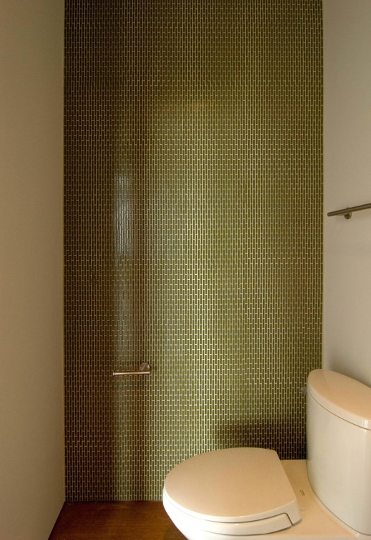
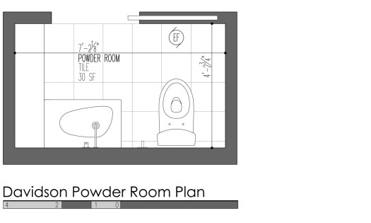
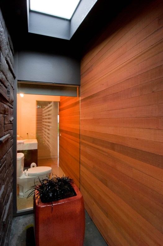
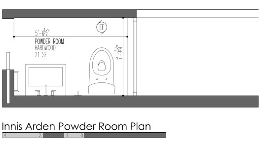
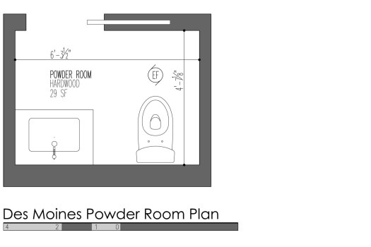
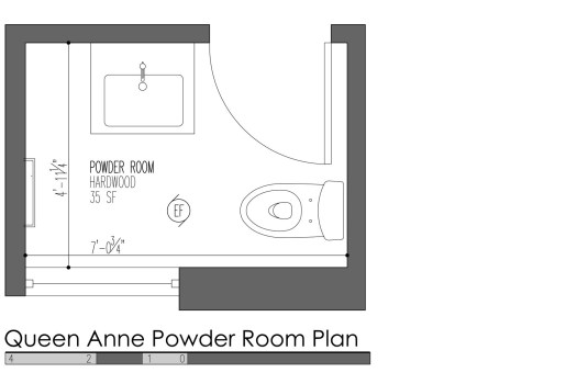
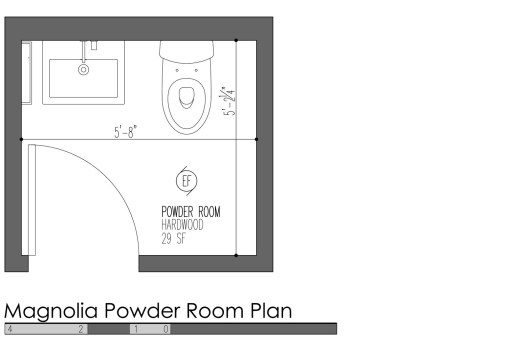
OTC loans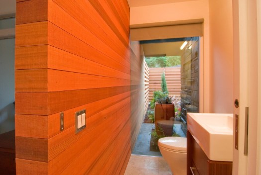 Powder rooms are different enough from typical bathrooms that they deserve their own design post. It’s not just that powder room design eliminates the bathtub/shower, but that powder rooms are also less a function of everyday use and more designed specifically for guests. Because powder rooms are usually designed into a home to accommodate visitors, they can (and often should) include a more refined level of design than the typical bathroom. We don’t mean to say that a powder room needs to be over-designed or opulent, but simply that the powder room is a good place to have some fun with the design. This might include a design feature or a pleasant surprise that may not be part of the home’s typical design palette. Today’s post takes a close look at 5 design features for the powder room which can be used on their own or in combination.
SINK & CABINET INTEGRATION
Powder rooms are different enough from typical bathrooms that they deserve their own design post. It’s not just that powder room design eliminates the bathtub/shower, but that powder rooms are also less a function of everyday use and more designed specifically for guests. Because powder rooms are usually designed into a home to accommodate visitors, they can (and often should) include a more refined level of design than the typical bathroom. We don’t mean to say that a powder room needs to be over-designed or opulent, but simply that the powder room is a good place to have some fun with the design. This might include a design feature or a pleasant surprise that may not be part of the home’s typical design palette. Today’s post takes a close look at 5 design features for the powder room which can be used on their own or in combination.
SINK & CABINET INTEGRATION
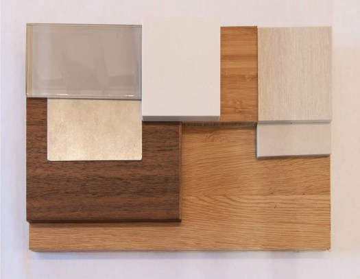
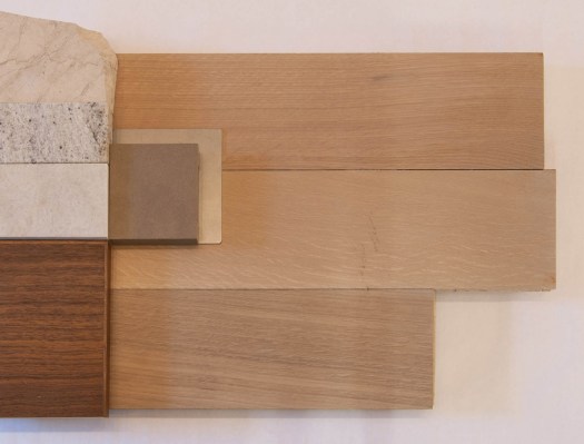
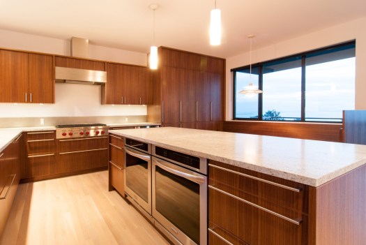
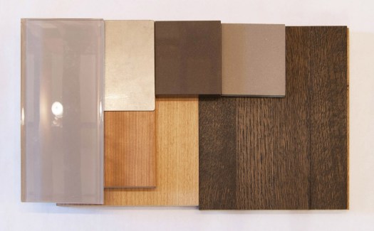
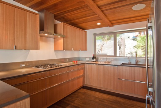
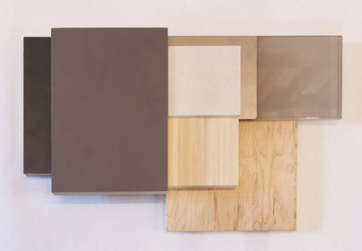
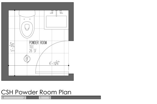 SPECIFICATIONS
 SPECIFICATIONS
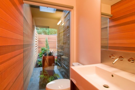
 SPECIFICATIONS
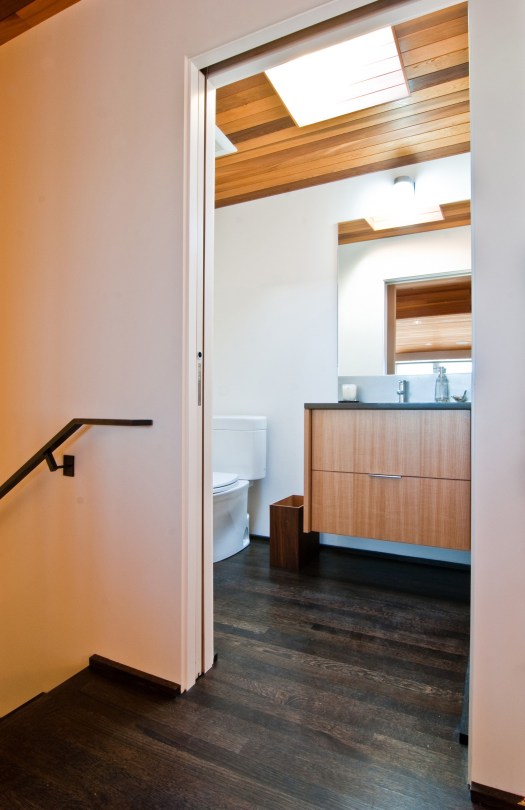
 SPECIFICATIONS
 SPECIFICATIONS
 SPECIFICATIONS
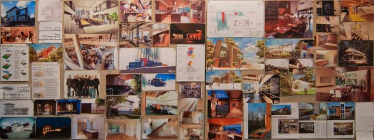
 PROJECT SCALE: The scale of work on a project may be the most important factor of them all. Like most small to medium-sized firms, BUILD requires the design work to have critical mass in order to take it on as a project. There is a certain threshold of
  PROJECT PHASING: It’s not unusual for homeowners to propose breaking a larger project into smaller phases over time. The advantages of doing so include a greater timeline to spread out the design and construction costs, the possibility of living in a home undergoing a substantial renovation, having the flexibility to make design changes based on previous phases, or being able to stop work at a natural breaking point. As compelling as these options are, the disadvantages typically outweigh the advantages. Phasing typically increases the design and construction costs, it complicates the design and construction process, and it may scare away architects because it doesn’t meet the critical mass of scale discussed above. Plus, projects are, at a minimum, an added responsibility for a client to be involved with, if not a large drain of time, energy, and money. For this reason, we always recommend that clients relocate during construction. (Nothing quite like “camping” while being emotionally drained, over many months — avoid!)
CONSIDERATIONS: Most architects are much more likely to take on the work if the entire project can be designed at once. If phasing is important to the project goals, we recommend a “master plan” to include all phases of design work. While the construction could always be broken down into separate phases at different times, the design time (and subsequent design fees) would be limited to one package of work. We also recommend getting the entire package permitted at once to optimize the building department’s time and contain the permitting fees. Lastly, any firm committed to helping their clients get projects completed should also be able to help point their clients to construction lenders that may very well allow a project to be completed in one pass rather than phasing (stay tuned for a future blog post on construction lending).
PROJECT PHASING: It’s not unusual for homeowners to propose breaking a larger project into smaller phases over time. The advantages of doing so include a greater timeline to spread out the design and construction costs, the possibility of living in a home undergoing a substantial renovation, having the flexibility to make design changes based on previous phases, or being able to stop work at a natural breaking point. As compelling as these options are, the disadvantages typically outweigh the advantages. Phasing typically increases the design and construction costs, it complicates the design and construction process, and it may scare away architects because it doesn’t meet the critical mass of scale discussed above. Plus, projects are, at a minimum, an added responsibility for a client to be involved with, if not a large drain of time, energy, and money. For this reason, we always recommend that clients relocate during construction. (Nothing quite like “camping” while being emotionally drained, over many months — avoid!)
CONSIDERATIONS: Most architects are much more likely to take on the work if the entire project can be designed at once. If phasing is important to the project goals, we recommend a “master plan” to include all phases of design work. While the construction could always be broken down into separate phases at different times, the design time (and subsequent design fees) would be limited to one package of work. We also recommend getting the entire package permitted at once to optimize the building department’s time and contain the permitting fees. Lastly, any firm committed to helping their clients get projects completed should also be able to help point their clients to construction lenders that may very well allow a project to be completed in one pass rather than phasing (stay tuned for a future blog post on construction lending).
 DESIGN COMPETITION: While architectural competition has become popular among the starchitects (celebrity architects doing high-profile museums around the world), the idea has never translated well to residential work. When a client explains that BUILD will be competing against multiple (as many as five or six other) architects, it’s almost immediate grounds to politely bow-out of the project consideration. While architects like a healthy amount of competition, it’s not difficult to do a quick time vs. value calculation and conclude that the time involved in competing would be better spent on projects you already have on your desk. Current clients tend to appreciate the commitment as well.
CONSIDERATIONS: In the information age, it’s easier than ever for homeowner’s to do their homework on design firms. Between an architecture firm’s
DESIGN COMPETITION: While architectural competition has become popular among the starchitects (celebrity architects doing high-profile museums around the world), the idea has never translated well to residential work. When a client explains that BUILD will be competing against multiple (as many as five or six other) architects, it’s almost immediate grounds to politely bow-out of the project consideration. While architects like a healthy amount of competition, it’s not difficult to do a quick time vs. value calculation and conclude that the time involved in competing would be better spent on projects you already have on your desk. Current clients tend to appreciate the commitment as well.
CONSIDERATIONS: In the information age, it’s easier than ever for homeowner’s to do their homework on design firms. Between an architecture firm’s  DESIGN AS PRIORITY: Any architect worth their college diploma and extensive licensing requirements needs to be proud of their design work when the project is complete. Potential clients that express the importance of design on their project will typically elicit more attention from an architect. Client’s committed to good design show it in a variety of ways that may involve having a clear idea of their goals, making decisions, and being organized with their thoughts. As architects, we are not looking for a client to have set thoughts on what the project should look like or how it should lay-out. That’s our job. We typically guide our clients in a process that achieves a relatively clear pathway to a functional and elegant design solution. It helps when everyone is on-board with this approach and equally excited about the value of good design.
CONSIDERATIONS: We understand that there are many things that compete for a client’s hard-earned dollars; we have similar goals as many of our clients and we also have kids (some heading toward things like braces and, before we blink, college). We appreciate the amount of money that it takes to complete a substantial remodel or new home. So, we always emphasize in our potential client meetings that design quality should be a primary motivation so that clients can feel committed to putting the resources (or as previously mentioned, resources and a construction loan) into the project.
DESIGN AS PRIORITY: Any architect worth their college diploma and extensive licensing requirements needs to be proud of their design work when the project is complete. Potential clients that express the importance of design on their project will typically elicit more attention from an architect. Client’s committed to good design show it in a variety of ways that may involve having a clear idea of their goals, making decisions, and being organized with their thoughts. As architects, we are not looking for a client to have set thoughts on what the project should look like or how it should lay-out. That’s our job. We typically guide our clients in a process that achieves a relatively clear pathway to a functional and elegant design solution. It helps when everyone is on-board with this approach and equally excited about the value of good design.
CONSIDERATIONS: We understand that there are many things that compete for a client’s hard-earned dollars; we have similar goals as many of our clients and we also have kids (some heading toward things like braces and, before we blink, college). We appreciate the amount of money that it takes to complete a substantial remodel or new home. So, we always emphasize in our potential client meetings that design quality should be a primary motivation so that clients can feel committed to putting the resources (or as previously mentioned, resources and a construction loan) into the project.
 FINANCIAL HONESTY: In order to correctly determine the practicality and feasibility of a project, architects need
  It’s been more than a little while since we’ve posted an On the Radar update. We’ve been pretty busy around BUILD World Headquarters, but we’re never too buried in work to stay inspired. Here are the latest people, projects, and perspectives that have caught our eyes and piqued our interest.
DESIGNing
It’s been more than a little while since we’ve posted an On the Radar update. We’ve been pretty busy around BUILD World Headquarters, but we’re never too buried in work to stay inspired. Here are the latest people, projects, and perspectives that have caught our eyes and piqued our interest.
DESIGNing MODELing
 DEVELOPing
 Menlo Oaks 2, an Eichler home remodeled by
 Don’t let a little
  CALCULATing
 ORGANIZing

 INSPIRing
 Even the New York Times is getting in on the action
  EXHIBITing
 UW Headlines exhibit for 2014 kicks off in little over a month. For local firms interested in showcasing their works in progress,
  ART BOMBing
 PARTYing
 LECTURing
 CONTRIBUTing
 Cheers + Stay Inspired, from your friends at Team BUILD
 The
The 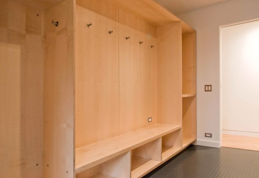
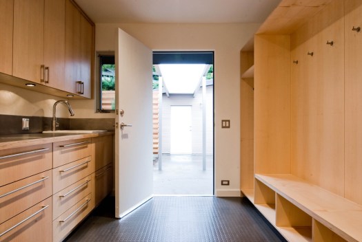
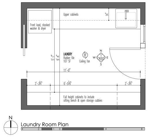 On the opposite side of the room are wall to wall cabinets with door and drawer faces that house the washer, dryer, sink, and household storage in addition to providing plenty of countertop space.
 Because the cabinets at a mud & laundry room need to take a bit more abuse, we used an apple-ply with exposed edges. The highly durable and easily cleanable rubber floor is T-106 from Commercial Interiors. (
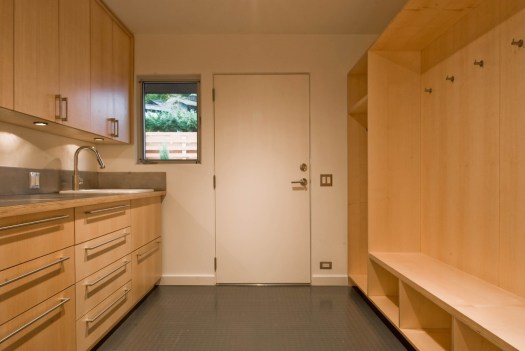 A more simplified version of the laundry & mud room can be found in the
  The floor is a concrete topping which is as durable as a floor can get. The application is cost effective and because the product is self-leveling, gravity takes care of any irregularities with the slab on grade below. Walls are painted with an eggshell acrylic to handle the additional moisture.
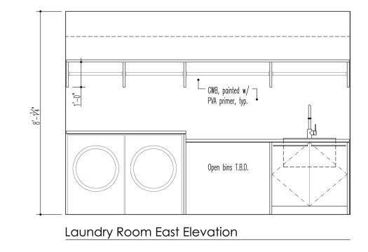
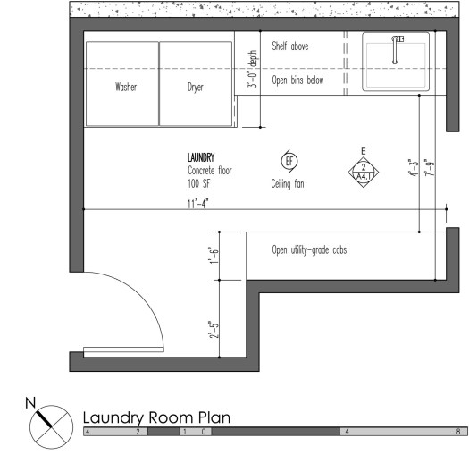 A single cabinet bay is faced with gray laminate doors to match the cabinets, the remaining cabinets are open cubby-style. The continuous line of upper offer four bays of hanging rods.
 Simpler still, is an installation at the
 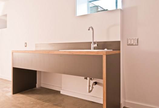 Gray Nevamar laminate on Europly, once again, play the lead role for materials, while a concrete slab keeps the space nearly maintenance free.
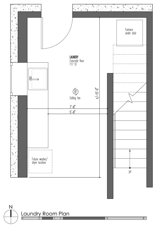 Regardless of the complexity (or simplicity) of the mud & laundry room, a handful of specifications are applicable. Here are the ones we like to use:
APPLIANCES
Regardless of the complexity (or simplicity) of the mud & laundry room, a handful of specifications are applicable. Here are the ones we like to use:
APPLIANCES


