<figure>
 © Jaime Navarro
- Architects: Victor Marquez
- Location: Calle Salvador Novo 9, Santa Catarina, 04010 Ciudad de México, CDMX, Mexico
- Area: 5705.0 m2
- Photographs: Jaime Navarro , Jorge Rodriguez Almanza
- Design Director: Victor Marquez
- Project Coordinator: Angeles Miranda
- Design Developer: Victor Marquez Arquitectos Sc
- Structural Engineering: Ubando
- Electric Engineering: Mepu Sa
- Lightning: Vma Sc
- Constructor: Sedena
- Electric Execution: Sedena
- Director Of Construction : M. Ing. Carlos De La Fuente
- Landscaping: Jaime Schmidt, Victor Marquez, Angeles Miranda
 © Jaime Navarro
 Sketch
 © Jaime Navarro
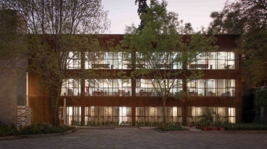
From the architect. The old colonial neighborhood of Coyoacan comprises some of the more notable cultural institutions of Mexico and the new national Center for Patrimonial Heritage is added to the list. The center´s main concept spins around the need to turn a private complex into a public space; thus, the programmatic idea of breaking the parts in order to organize them in smaller low-rise buildings that
 © Jaime Navarro
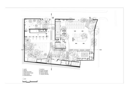
 Ground Floor
 © Jaime Navarro
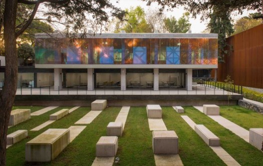
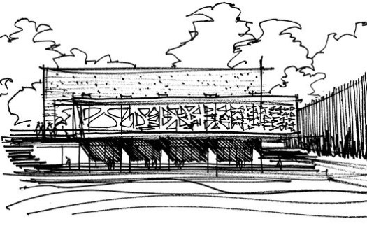
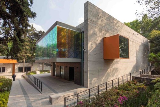
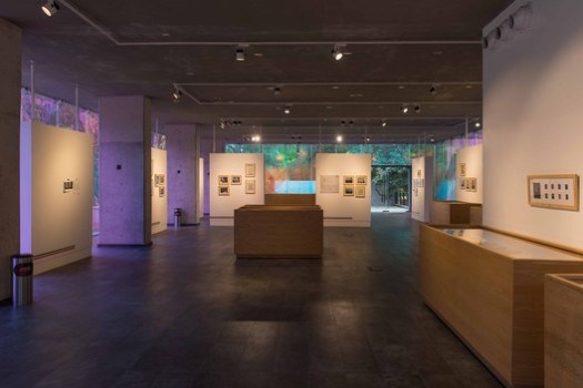
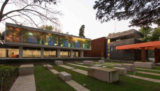
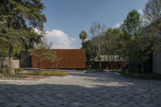
According to the architects, although some compositions are directly or indirectly referenced to some architectural ideas from Emilio Ambaz and Francisco Machado, from a design standpoint, the assumed influences come from University City, that spectacular array of pioneering modern architecture in the late 40’s and early 50’s. Among the principles that may be found in relationship to CU are a severe axial composition, that is often manipulated by the use of ramps, canopies or pergolas; the traditional use of black volcanic rock indigenous from this zone of the valley to build walls and contentions, and finally the use of simple volumes that acknowledge the relevance of classical elements of architecture such as the colonnade or the promenade. In counterpoint, the project’s central and stronger idea is best described by the design of the museum’s overhanging gallery. By imagining this volume as an art piece itself, we laid out it in a way it becomes the central exhibit of the complex. It can be particularly enjoyed from the café’s patio. The gallery’s dichroic-skin will break the spectrum of color depending on light temperature and intensity (outdoor and indoor) creating a organic and ever changing, kaleidoscopic effect, that incidentally references the chromatic stridence of Mexican folk Art. The authors have yet added another layer to the glass, a large-scale graphic pattern resembling a diffusing lattice that gives the impression of tattooing the building. The overlaid system distorts the relationship between the exterior and the interior, and also the connections between light and space, pushing the visitor towards the experience of a psychotropic trip.
 © Jorge Rodriguez Almanza
<img src="http://feeds.feedburner.com/~r/ArchDaily/~4/d8GDFTBFjWA" height="1" width="1" alt=""/>
