-
Align it.
-
Simplify it.
-
Order it.
-
Place it on axis with it.
-
Remove the barrier between the interior and the exterior of it.
-
Repeat it.
-
Repeat it.
-
Refer to that thing that someone else did to it sometime before in Norway, probably.
-
Establish a datum line through it.
-
Make a half-hearted and somewhat esoteric reference to the context in which it exists.
-
Note the direction of the sun in relation to it.
-
Put a sun shade on the south-facing elevation of it.
-
Remind us of what Le Corbusier did to it, preferably while using the words “Brise Soleil”
-
Paint it white.
-
Explain it while using large words without sounding too condescending.
-
Waterproof the hell out of it.
-
Allow it’s roof to leak, because that’s what Frank Lloyd Wright would do.
-
Remove all the furniture from it.
-
Publish a photograph of what you did to it.
-
Make it stand for something, It doesn’t really matter what, just something… anything
20 Things to do to it with the architecture
-
Align it.
-
Simplify it.
-
Order it.
-
Place it on axis with it.
-
Remove the barrier between the interior and the exterior of it.
-
Repeat it.
-
Repeat it.
-
Refer to that thing that someone else did to it sometime before in Norway, probably.
-
Establish a datum line through it.
-
Make a half-hearted and somewhat esoteric reference to the context in which it exists.
-
Note the direction of the sun in relation to it.
-
Put a sun shade on the south-facing elevation of it.
-
Remind us of what Le Corbusier did to it, preferably while using the words “Brise Soleil”
-
Paint it white.
-
Explain it while using large words without sounding too condescending.
-
Waterproof the hell out of it.
-
Allow it’s roof to leak, because that’s what Frank Lloyd Wright would do.
-
Remove all the furniture from it.
-
Publish a photograph of what you did to it.
-
Make it stand for something,
Continue reading "20 Things to do to it with the architecture"
How many architects does it take to screw in a lightbulb?
- Apparently the answer is 21.
One to sketch out the concept;
One to model it in Revit;
One to question the concept… “Does it have to screw?”;
One to write an addendum informing the contractors;
One to find the spec section and ASTM standards for screwability;
One to fill out the LEED paperwork for said lightbulb;
One to suggest a “stainless steel” lightbulb;
One to suggest a skylight instead of the lightbulb;
One to research alternate methods of screwing on the internet (Don’t google that while in the office);
One to suggest having a charette to brainstorm ideas about screwing in lightbulbs;
One (intern) to build a chipboard model of the lghtbulb;
One to suggest recessing the lightbulb;
One to issue addendum # 35 to have the contractor reverse the swing on the door in the room so the light switch for the lightbulb can be relocated to the other wall;
One to ask the design principal in charge to call the client to let them know we’re screwed;
One to call the structural engineer to see if the beam running through the lightbulb can be moved;
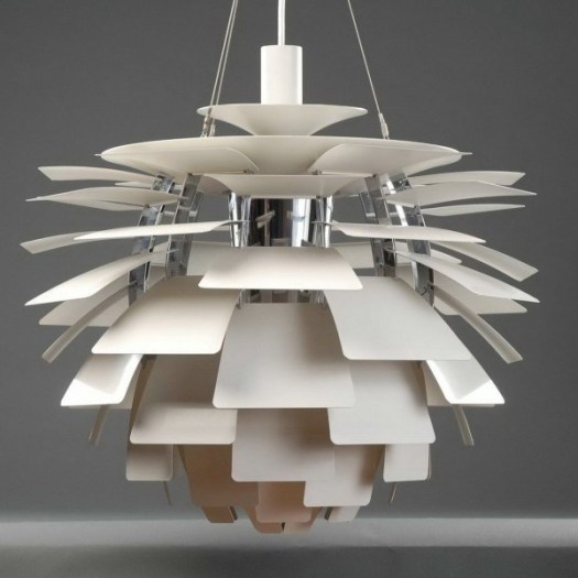
One to render the space showing a Louis Poulsen “artichoke” lamp instead of the lightbulb;
One to ask: “what the lightbulb wants to be?”;
One to discuss Le Corbusier’s use of lightbulbs throughout Villa Savoye;
One to google “Snohetta / lightbulbs”;
One to remove the boundary between the interior and the exterior of the lightbulb;
And finally;
One turn off the light while muttering “less is more…”

Not in my neighborhood
 The following is an excerpt from my neighborhood list serve:
……………………
From: Traditional Home <xxxxxxx[at]aol[dot]com>
The following is an excerpt from my neighborhood list serve:
……………………
From: Traditional Home <xxxxxxx[at]aol[dot]com>To: Modern House <xxxxxxx[at]squarespace[dot]com>
Cc: ‘CityHall’ <info[at]nimby[dot]gov>
Sent: Wednesday, April 16, 2014 1:05 PM
Subject: Re: Suggestions for your facade
Dear Modern Home,
l realize that your home design across the street from me may be a commentary on the current state of the social economic environment we find ourselves in at the beginning of the 21st Century; however, I feel a more historic facade would be in keeping with the character of this neighborhood. After all, one does not need to abandoned the lessons of the past in order to live in the present. The home I live in is historically charming, and still has all the comforts of the modern world. I even have a satellite dish (placed on the rear of the home of course). Obviously, modern conveniences do not need to conflict with an historic sensibility. Yet, your home has no charm at all. Your facade seems to scowl at me. Perhaps you could add more detail? I googled “brackets” and was surprised by the quantity of decorative eave options available. I would also recommend perusing the latest issues of Martha Stewart’s “Home” magazine. Granted, her design style is regionally specific to the upper middle class, but still, there is real value therein. I particularly enjoyed the recipes featuring pumpkin seeds. Perhaps you could incorporate some of her ideas into your design? And, of course, shutters are always an attractive addition to any home. What are you trying to prove with all that glass anyway?
…………………… From: Modern Home <xxxxxxx[at]squarespace[dot]com>To: Traditional House <xxxxxxx[at]aol[dot]com>
Cc: ’Dwell’ <info[at]dwellmag[dot]com>
Sent: Wednesday, April 16, 2014 7:15 PM
Subject: Re: Re: Suggestions for your facade
Dear Traditional Home,
I am not trying to prove anything. I am simply living in the “here and now.” Not everything in the past bears repeating. My grandfather was an alcoholic.
…………………… From: Traditional Home <xxxxxxx[at]aol[dot]com>To: Modern House <xxxxxxx[at]squarespace[dot]com>
Cc: ’CityHall’ <info[at]nimby[dot]gov>
Sent: Wednesday, April 16, 2014 8:24 PM
Subject: Re: Re: Re: Re: Suggestions for your facade
Dear Modern Home,
I’m sorry to hear about your grandfather. But, keep in mind that “those who ignore the past are destined to repeat it.” Also, I think you have too much glass on your house. I can see things inside.
…………………… From: Modern Home <xxxxxxx[at]squarespace[dot]com>To: Traditional House <xxxxxxx[at]aol[dot]com>
Cc: ’Dwell’ <info[at]dwellmag[dot]com>
Sent: Wednesday, April 16, 2014 9:11 PM
Subject: Re: Re: Re: Re: Re: Suggestions for your facade
Dear Traditional Home,
Are you implying that modernism causes substance abuse? Granted, you may have a point. But, I would ask that you refrain from looking into my private spaces. What I choose to do in my own living room is between me and my cats. You have no right to judge me. As a precaution, I’ve ordered custom retractable shades for all the windows that face your house. The shades are being shipped from Milan and should arrive in less than a year. In the meantime, I’ve installed a large portrait of Charles Eames in the front window. Do not look at it.
…………………… From: Traditional Home <xxxxxxx[at]aol[dot]com>To: Modern House <xxxxxxx[at]squarespace[dot]com>
Cc: ’CityHall’ <info[at]nimby[dot]gov>
Sent: Thursday, April 17, 2014 7:51 AM
Subject: Re: Re: Re: Re: Re: Re: Suggestions for your facade
Dear Modern Home,
I’ve spent some time studying the local sign ordinances and feel certain that the large portrait you have installed on the facade of your non-contextual dwelling is in violation of the zoning regulations. Please remove the “sign” immediately.
…………………… From: Modern Home <xxxxxxx[at]squarespace[dot]com>To: Traditional House <xxxxxxx[at]aol[dot]com>
Cc: ’Dwell’ <info[at]dwellmag[dot]com>
Sent: Friday, April 18, 2014 10:43 AM
Subject: Re: Re: Re: Re: Re: Re: Re: Suggestions for your facade
Dear Traditional Home,
Per your request, I have removed the portrait of Charles Eames. In its place, I have displayed an enlarged photograph of Victorian scroll-work that was typically installed along the eaves of front porches in homes of your style. I have drawn a large question mark on the photograph, subtly raising a question: “Why was this part of the historic character of your home omitted, and by whom?”
…………………… From: Traditional Home <xxxxxxx[at]aol[dot]com>To: Modern House <xxxxxxx[at]squarespace[dot]com>
Cc: ’CityHall’ <info[at]nimby[dot]gov>
Sent: Friday, April 18, 2014 10:44 AM
Subject: Re: Re: Re: Re: Re: Re: Re: Re: Suggestions for your facade
Dear Modern Home,
I do not appreciate this assault on my good name. I have done everything within my means to faithfully recreate this home in keeping with the charms of a by-gone era. And, I have aspired to become a valued member of this prestigious neighborhood. Perhaps you should consider doing the same. How dare you belittle my character, and the character of this neighborhood with your flat roofs and your vacant stares.
…………………… From: Modern Home <xxxxxxx[at]squarespace[dot]com>To: Traditional House <xxxxxxx[at]aol[dot]com>
Cc: ’Dwell’ <info[at]dwellmag[dot]com>
Sent: Friday, April 18, 2014 1:09 PM
Subject: Re: Re: Re: Re: Re: Re: Re: Re: Re: Suggestions for your facade
Dear Traditional Home,
I think you’ve confused my vacant stare with a complete lack of appreciation for your colonial way of life. In the future, please consider parking your carriage in the rear of your homestead, near the smokehouse, or the pigsty. And, stop looking into my bathroom windows.
…………………… From: Traditional Home <xxxxxxx[at]aol[dot]com>To: Modern House <xxxxxxx[at]squarespace[dot]com>
Cc: ’CityHall’ <info[at]nimby[dot]gov>: ’WilsonWilsonWilson&Wilsonpllc’ <MrWilson[at]expensivesuits[dot]com>
Sent: Saturday, April 19, 2014 11:28 PM
Subject: Re: Re: Re: Re: Re: Re: Re: Re: Re: Re: Re: Suggestions for your facade
Mr. “so-called” Modern Home,
I, and my lawyers, have filed a motion to appeal the construction of your home based on numerous violations of the neighborhood appearance guidelines that I have recently begun drafting. Please cease all construction activities immediately.
…………………… From: Modern Home <xxxxxxx[at]squarespace[dot]com>To: Traditional House <xxxxxxx[at]aol[dot]com>
Cc: ’Dwell’ <info[at]dwellmag[dot]com>
Sent: Saturday, April 19, 2014 11:46 PM
Subject: Re: Suggestions for you to screw off
Traditional Home,
Screw you. I will cease nothing. Construction on this home was completed 6 years ago. In fact, I reviewed the county records, and my home was completed 3 years prior to yours. You are blocking MY view. Please move your “home” to the left.
…………………… From: Traditional Home <xxxxxxx[at]aol[dot]com>To: Modern House <xxxxxxx[at]squarespace[dot]com>
Cc: ’CityHall’ <info[at]nimby[dot]gov>
Sent: Saturday, April 19, 2014 11:47 PM
Subject: Re: Suggestions for you to go to hell
Modern Home,
I will not move. Furthermore, this modernist aggression against my way of life will not stand. It will not stand, I say.
…………………… From: Modern Home <xxxxxxx[at]squarespace[dot]com>To: Traditional House <xxxxxxx[at]aol[dot]com>
Cc: ’Dwell’ <info[at]dwellmag[dot]com>
Sent: Saturday, April 19, 2014 11:49 PM
Subject: Re: the burning of Atlanta
“Traditional” Home,
Jesus, Scarlett, have an iced tea. You sound like you’re having the vapors. Perhaps you should rest a spell on your porch and fan yourself. You seem pale; a pale representation of a far, far better place.
…………………… From: Traditional Home <xxxxxxx[at]aol[dot]com>To: Modern House <xxxxxxx[at]squarespace[dot]com>
Cc: ’CityHall’ <info[at]nimby[dot]gov>
Sent: Saturday, April 19, 2014 11:51 PM
Subject: Re: DO NOT EMAIL ME AGAIN
Modern “Home“,
You sir, are a monster.
…………………… From: Modern Home <xxxxxxx[at]squarespace[dot]com>To: Traditional House <xxxxxxx[at]aol[dot]com>
Cc: ’AMC’ <iloveoldmovies[at]AMCtv[dot]com>
Sent: Sunday, April 20, 2014 6:55 AM
Subject: Re: Re: DO NOT EMAIL ME AGAIN EITHER (dickweed)
Dear Ms. O’Hara,
Stop staring at me.
…………………… CREDITS: This post has been dedicated to the good fight - Hang in there @ModernOakwood. The photo used in this post is from Ian Sane‘s photostream on Flickr and has been used under the creative commons license - the original image can be found HERENot in my neighborhood
 The following is an excerpt from my neighborhood list serve:
……………………
From: Traditional Home <xxxxxxx[at]aol[dot]com>
The following is an excerpt from my neighborhood list serve:
……………………
From: Traditional Home <xxxxxxx[at]aol[dot]com>To: Modern House <xxxxxxx[at]squarespace[dot]com>
Cc: ‘CityHall’ <info[at]nimby[dot]gov>
Sent: Wednesday, April 16, 2014 1:05 PM
Subject: Re: Suggestions for your facade
Dear Modern Home,
l realize that your home design across the street from me may be a commentary on the current state of the social economic environment we find ourselves in at the beginning of the 21st Century; however, I feel a more historic facade would be in keeping with the character of this neighborhood. After all, one does not need to abandoned the lessons of the past in order to live in the present. The home I live in is historically charming, and still has all the comforts of the modern world. I even have a satellite dish (placed on the rear of the home of course). Obviously, modern conveniences do not need to conflict with an historic sensibility. Yet, your home has no charm at all. Your facade seems to scowl at me. Perhaps you could add more detail? I googled “brackets” and was surprised by the quantity of decorative eave options available. I would also recommend perusing the latest issues of Martha Stewart’s “Home” magazine. Granted, her design style is regionally specific to the upper middle class, but still, there is real value therein. I particularly enjoyed the recipes featuring pumpkin seeds. Perhaps you could incorporate some of her ideas into your design? And, of course, shutters are always an attractive addition to any home. What are you trying to prove with all that glass anyway?
…………………… From: Modern Home <xxxxxxx[at]squarespace[dot]com>To: Traditional House <xxxxxxx[at]aol[dot]com>
Cc: ’Dwell’ <info[at]dwellmag[dot]com>
Sent: Wednesday, April 16, 2014 7:15 PM
Subject: Re: Re: Suggestions for your facade
Dear Traditional Home,
I am not trying to prove anything. I am simply living in the “here and now.” Not everything in the past bears repeating. My grandfather was an alcoholic.
…………………… From: Traditional Home <xxxxxxx[at]aol[dot]com>To: Modern House <xxxxxxx[at]squarespace[dot]com>
Cc: ’CityHall’ <info[at]nimby[dot]gov>
Sent: Wednesday, April 16, 2014 8:24 PM
Subject: Re: Re: Re: Re: Suggestions for your facade
Dear Modern Home,
I’m sorry to hear about your grandfather. But, keep in mind that “those who ignore the past are destined to repeat it.” Also, I think you have too much glass on your house. I can see things inside.
…………………… From: Modern Home <xxxxxxx[at]squarespace[dot]com>To: Traditional House <xxxxxxx[at]aol[dot]com>
Cc: ’Dwell’ <info[at]dwellmag[dot]com>
Sent: Wednesday, April 16, 2014 9:11 PM
Subject: Re: Re: Re: Re: Re: Suggestions for your facade
Dear Traditional Home,
Are you implying that modernism causes substance abuse? Granted, you may have a point. But, I would ask that you refrain from looking into my private spaces. What I choose to do in my own living room is between me and my cats. You have no right to judge me. As a precaution, I’ve ordered custom retractable shades for all the windows that face your house. The shades are being shipped from Milan and should arrive in less than a year. In the meantime, I’ve installed a large portrait of Charles Eames in the front window. Do not look at it.
…………………… From: Traditional Home <xxxxxxx[at]aol[dot]com>To: Modern House <xxxxxxx[at]squarespace[dot]com>
Cc: ’CityHall’ <info[at]nimby[dot]gov>
Sent: Thursday, April 17, 2014 7:51 AM
Subject: Re: Re: Re: Re: Re: Re: Suggestions for your facade
Dear Modern Home,
I’ve spent some time studying the local sign ordinances and feel certain that the large portrait you have installed on the facade of your non-contextual dwelling is in violation of the zoning regulations. Please remove the “sign” immediately.
…………………… From: Modern Home <xxxxxxx[at]squarespace[dot]com>To: Traditional House <xxxxxxx[at]aol[dot]com>
Cc: ’Dwell’ <info[at]dwellmag[dot]com>
Sent: Friday, April 18, 2014 10:43 AM
Subject: Re: Re: Re: Re: Re: Re: Re: Suggestions for your facade
Dear Traditional Home,
Per your request, I have removed the portrait of Charles Eames. In its place, I have displayed an enlarged photograph of Victorian scroll-work that was typically installed along the eaves of front porches in homes of your style. I have drawn a large question mark on the photograph, subtly raising a question: “Why was this part of the historic character of your home omitted, and by whom?”
…………………… From: Traditional Home <xxxxxxx[at]aol[dot]com>To: Modern House <xxxxxxx[at]squarespace[dot]com>
Cc: ’CityHall’ <info[at]nimby[dot]gov>
Sent: Friday, April 18, 2014 10:44 AM
Subject: Re: Re: Re: Re: Re: Re: Re: Re: Suggestions for your facade
Dear Modern Home,
I do not appreciate this assault on my good name. I have done everything within my means to faithfully recreate this home in keeping with the charms of a by-gone era. And, I have aspired to become a valued member of this prestigious neighborhood. Perhaps you should consider doing the same. How dare you belittle my character, and the character of this neighborhood with your flat roofs and your vacant stares.
…………………… From: Modern Home <xxxxxxx[at]squarespace[dot]com>To: Traditional House <xxxxxxx[at]aol[dot]com>
Cc: ’Dwell’ <info[at]dwellmag[dot]com>
Sent: Friday, April 18, 2014 1:09 PM
Subject: Re: Re: Re: Re: Re: Re: Re: Re: Re: Suggestions for your facade
Dear Traditional Home,
I think you’ve confused my vacant stare with a complete lack of appreciation for your colonial way of life. In the future, please consider parking your carriage in the rear of your homestead, near the smokehouse, or the pigsty. And, stop looking into my bathroom windows.
…………………… From: Traditional Home <xxxxxxx[at]aol[dot]com>To: Modern House <xxxxxxx[at]squarespace[dot]com>
Cc: ’CityHall’ <info[at]nimby[dot]gov>: ’WilsonWilsonWilson&Wilsonpllc’ <MrWilson[at]expensivesuits[dot]com>
Sent: Saturday, April 19, 2014 11:28 PM
Subject: Re: Re: Re: Re: Re: Re: Re: Re: Re: Re: Re: Suggestions for your facade
Mr. “so-called” Modern Home,
I, and my lawyers, have filed a motion to appeal the construction of your home based on numerous violations of the neighborhood appearance guidelines that I have recently begun drafting. Please cease all construction activities immediately.
…………………… From: Modern Home <xxxxxxx[at]squarespace[dot]com>To: Traditional House <xxxxxxx[at]aol[dot]com>
Cc: ’Dwell’ <info[at]dwellmag[dot]com>
Sent: Saturday, April 19, 2014 11:46 PM
Subject: Re: Suggestions for you to screw off
Traditional Home,
Screw you. I will cease nothing. Construction on this home was completed 6 years ago. In fact, I reviewed the county records, and my home was completed 3 years prior to yours. You are blocking MY view. Please move your “home” to the left.
…………………… From: Traditional Home <xxxxxxx[at]aol[dot]com>To: Modern House <xxxxxxx[at]squarespace[dot]com>
Cc: ’CityHall’ <info[at]nimby[dot]gov>
Sent: Saturday, April 19, 2014 11:47 PM
Subject: Re: Suggestions for you to go to hell
Modern Home,
I will not move. Furthermore, this modernist aggression against my way of life will not stand. It will not stand, I say.
…………………… From: Modern Home <xxxxxxx[at]squarespace[dot]com>To: Traditional House <xxxxxxx[at]aol[dot]com>
Cc: ’Dwell’ <info[at]dwellmag[dot]com>
Sent: Saturday, April 19, 2014 11:49 PM
Subject: Re: the burning of Atlanta
“Traditional” Home,
Jesus, Scarlett, have an iced tea. You sound like you’re having the vapors. Perhaps you should rest a spell on your porch and fan yourself. You seem pale; a pale representation of a far, far better place.
…………………… From: Traditional Home <xxxxxxx[at]aol[dot]com>To: Modern House <xxxxxxx[at]squarespace[dot]com>
Cc: ’CityHall’ <info[at]nimby[dot]gov>
Sent: Saturday, April 19, 2014 11:51 PM
Subject: Re: DO NOT EMAIL ME AGAIN
Modern “Home“,
You sir, are a monster.
…………………… From: Modern Home <xxxxxxx[at]squarespace[dot]com>To: Traditional House <xxxxxxx[at]aol[dot]com>
Cc: ’AMC’ <iloveoldmovies[at]AMCtv[dot]com>
Sent: Sunday, April 20, 2014 6:55 AM
Subject: Re: Re: DO NOT EMAIL ME AGAIN EITHER (dickweed)
Dear Ms. O’Hara,
Stop staring at me.
…………………… CREDITS: This post has been dedicated to the good fight - Hang in there @ModernOakwood. The photo used in this post is from Ian Sane‘s photostream on Flickr and has been used under the creative commons license - the original image can be found HERESketches of Venice
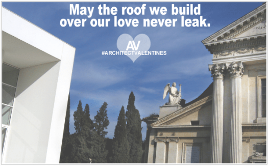
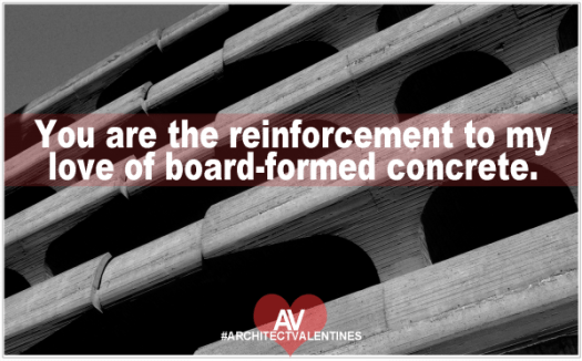
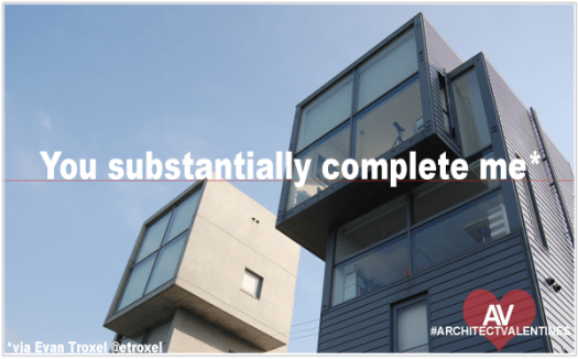
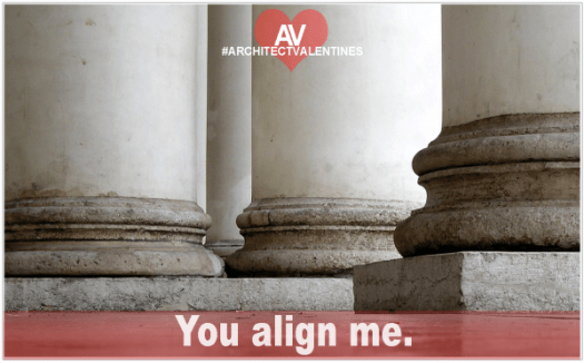
ARCHITECT VALENTINES 2014
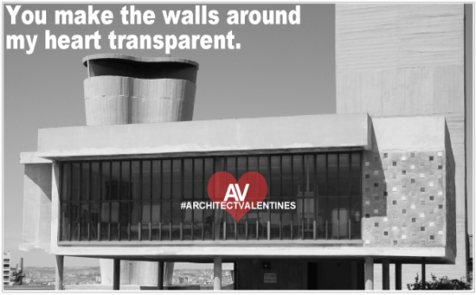
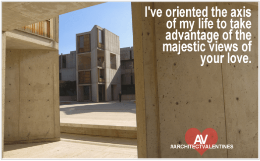
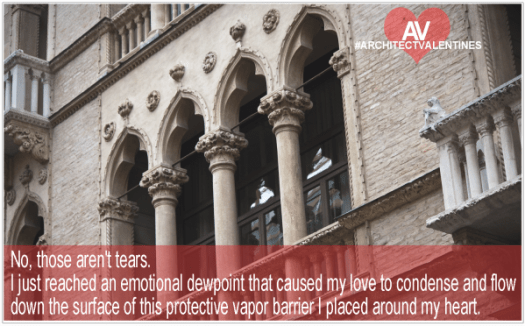
Architects are a romantic bunch. But, we tend to be busy. We know we should stop working on this design for a while and go buy some flowers or chocolate or something. We know that. But, we have a deadline. Maybe we can pick up a card from the internet on the way home.
Here you go.
You’re welcome:
.
If you still haven’t found anything you like, be sure to flip through some of the older entries - HERE, HERE or HERE
Much love, From the Architects
.
.
.
.
IMAGE CREDITS - All of the photographs used in these graphics are awesome, and were found on FLICKr and have been used under the creative commons license. Links to the original photos can be found Here:
photo 1, photo 2, photo 3, photo 4, photo 5, photo 6, photo 7, photo 8, photo 9, photo 10, photo 11, photo 12
ARCHITECT VALENTINES 2014




 .
If you still haven’t found anything you like, be sure to flip through some of the older entries - HERE, HERE or HERE
Much love, From the Architects
<3 Coffee with an Architect
.
.
.
.
IMAGE CREDITS - All of the photographs used in these graphics are awesome, and were found on FLICKr and have been used under the creative commons license. Links to the original photos can be found Here:
photo 1, photo 2, photo 3, photo 4, photo 5, photo 6, photo 7, photo 8, photo 9, photo 10, photo 11, photo 12
.
If you still haven’t found anything you like, be sure to flip through some of the older entries - HERE, HERE or HERE
Much love, From the Architects
<3 Coffee with an Architect
.
.
.
.
IMAGE CREDITS - All of the photographs used in these graphics are awesome, and were found on FLICKr and have been used under the creative commons license. Links to the original photos can be found Here:
photo 1, photo 2, photo 3, photo 4, photo 5, photo 6, photo 7, photo 8, photo 9, photo 10, photo 11, photo 12
Wishing you an even more awesome 2014
Hi Guys,
First of all THANK YOU!
I just wanted to take a minute and say thank you to all of you for making 2013 the best year ever for me here at Coffee with an Architect (you can imagine me typing this from my secluded evil liar headquarters perched over a majestic cliff edge, at least that’s how I like to imagine it while I type these things. It tends to help). 2013 was a crazy year for me. I think I finally started to get my footing with my professional life, and business started picking up. So much so, that I’ve had the best year of my career so far. Not all that surprisingly, as I got busier and busier at work, my ability or willingness to write for the blog has waned, and I’ve slowed down on the postings this year. I even considered stopping altogether at one point. But, when I thought of stopping, I was reminded of the hundreds of people who’ve reached out to me over the years to let me know that they appreciate my particular form of angst-ridden representations of my love for the profession of Architecture. So, as long as you all will continue to tolerate me, I’ll stick around. In fact, I plan to make 2014 the best year ever for Coffee with an Architect.
Second of all YOU ARE ALL AWESOME!
One of the most satisfying things I’ve ever done here at the blog has been to help raise some money for a good cause. Last year we raised about $1100 for Architecture for Humanity. This year, we’ve done even better. As of 12/28/13 we’ve raised just under $1700! I’ll be sending the check to Architecture for Humanity on Monday. So, if you’re one of those “wait til the last minute to donate” kind of people. This would be that “last minute”!! If you want to add your contribution to the Coffee with an Architect 2013 Fundraiser please do! All contributions to the Paypal account and all profits from purchases from my shop made by Monday 12/30/13 at noon will be added to the total. Please consider taking a moment to contribute. It really has been an incredible thing we’ve done here at Coffee with an Architect.
TO DONATE CLICK HERE TO BUY SOMETHING FROM THE SHOP
TO DONATE CLICK HERE TO DONATE TO THE PAYPAL ACCOUNT
So, how much should I make the check out for?
And lastly, I really love you guys.
Here’s to an awesome 2014
Cheers,
Jody
Some reasons Santa Claus is probably an architect
FUNDRAISER UPDATE! There are only a few days left to help us raise some money for Architecture for Humanity. So far we’re raised over $1700. Which is seriously awesome. THANK YOU GUYS! But, I bet we could raise a bit more, what do you say, want to help us out? Click HERE for all the details. I’ll be sending the check in a few days, so time is running out!
And, we now return you to the Angstmas celebration already in progress:
Some reasons Santa Claus is probably an architect:
Workshop full of elves, Studio full of interns, same thing.
He is fond of coal, err … charcoal.
He is a white male who’s over weight.
He works all year round, even over the holidays.
Traditional Nordic Vernacular.
He carries a bag, never a briefcase.
He is always trying to give the children/clients exactly what they ask for.
He is surrounded by white.
He assumes the chimney will be the central organizing element in every home he visits.
He knows if you’ve been good or bad, but he’ll probably just give you whatever you asked for anyway.
He only steps foot in a mall once a year.
It only takes one major project to keep the studio/workshop employed all year long.
He set a deadline for December 25th.
He will have to pull an all-nighter to meet that deadline on December 25th.
What he does seems impossible and magical.
He takes all the credit for the work the elves/interns did.
He will have a lot of Lego.
He will always be there, even if you don’t believe in him.
plus,
You don’t need to pay him.
Merry Merry!
All images were used under the creative commons license and can be found HERE and HERE
More Christmas cards from the Architects
It’s that time of year again, that festive time of the season when architects all over the world put down their felt-tip pens just long enough to wish you and yours a happy holidays. Then they pick up the pen again and resume work.
Merry Christmas from the Architects.
.
I think my heart just grew 3 sizes this day.
.
For even more holiday spirit from the Architects, check out these cards from Life of an Architect - HERE , and HERE
Or some of my own HERE, and HERE
Or, if you’d like a reason to truly celebrate the season, please consider donating to my fundraiser for Architecture for Humanity. More info can be found HERE.
Merry Merry.
Merry Christmas from the Architects
It’s possible that I’m experiencing a small amount of Christmas spirit. Mostly because of the ghost of Christmas future just showed me Le Corbusier’s grave. I think he designed it himself and it completely freaked me out. I’ve learned my lesson spirit! I will keep the spirit of Christmas in my heart all year long. Starting now. Someone fetch me the Pritzker prized winning turkey in the window of the local butcher and tell tiny Tim van der Rohe to get ready for the best Christmas dinner ever. I will be roasting it on a grid.
Happy Holidays!
.

.
Oh yeah, Please consider donating to my fundraiser too! That may be a more productive way to celebrate the season. FIND OUT HOW TO DONATE HERE!
So, things seem to be going well
I take a month off and this is what happens?
It seems like everywhere I look lately someone is taking shots at the profession. Apparently we are trying to melt people and cars with our concave skyscraper designs while frying eggs on the sidewalk (See exhibit A). Although clearly we were just kidding about that, because all of our designs are really meant to be taken as farce. We’re the new comedians! We’re ironically iconic (see exhibit B)!
We’re just trying to be the best designers we can. But, you try to save one tree on the site of the church your designing and suddenly everyone is all “Oh my, that looks like a giant penis” if you happen to view it on google earth. Hilarious! (See exhibit C). Well at least we didn’t locate the fire hydrant exactly at the tip of the vaguely penis shaped form. Oh wait, we did (See exhibit D). Nice job.
Yay! Architecture is phallic! What a surprise. What a great story that makes. But, it’s so “old school”, don’t you think?
Maybe we could interest you in something more contemporary and feminine? Perhaps something with a few more curves and a suggestive opening in the middle? (See exhibit E). Brilliant! It’s a giant steel vagina and it’s full of handsome sweating men playing with their balls… Hahahahahahahahha… Maybe this will get us some much needed national attention (See exhibit G).
Ok. Clearly we are not doing a good job representing our profession in the national media. Maybe architects are not telling our own story very effectively.
Perhaps there’s a work of literature that could help? Say, something about an architect (and/or F-head) so attached to his ideals that he would rather destroy his work than allow it’s perfection to be compromised by someone who thinks he owns it just because he paid for it. That would be perfect. (See exhibit H).
Or, we could get someone else to speak for us. Is there’s a wealthy media mogul or hip-hop artist out there with more than a passing interest in the profession who could stand up and speak for us? Brad Pitt certainly tried and failed. Wait. I know, maybe Kanye can help. He designed some shoes didn’t he? I bet he loves to “hang out with architects, mostly”, because architects “wanna make things as dope as possible”, right? (see exhibit I). Oooo! Maybe Kanye could teach a Harvard and tell us how “the world can be saved through design, and everything needs to actually be ‘architected’” (see Exhibit I give up)
I don’t think I’ve seen architects get this much attention in years. And, I just think it’s wonderfu…of what the hell is wrong with us?
Is this the image we want to paint of the profession? Are we just a bunch of egomaniacal individualist creative types only interested in our own, clearly superior, phallic/vaginal delusions of grandeur?
The answer to that is “no” by the way.
But, it doesn’t make as good of a story.
And to be honest, until we give the media something better to talk about…
they’re just going to run with the story about the church that’s shaped like a dick.
.
.
.
The photo of the Eiffel tower looking all tall and suggestive has been used under the creative commons license. Original can be found HERE.
Architects can make awesome things happen
 Hey guys! (non-angsty post in 3…2…1…)
At the end of the year I make a donation of a portion of my company profits to charity. And, last year I asked for your help to match my contributions. You all were amazing, and together we raised over $1100 for Architecture for Humanity. Architecture for Humanity is an amazing organization that (to me) represents the best part of what it means to be an architect.
Seriously, 2012′s fundraiser was incredible! You all are the best.
But, this year, I think we should try to top last years donation.
I’ve had a pretty good year in 2013, so I’ll be donating $800 of my own money to Architecture for Humanity at the end of the year. Plus, all the profits from the sales of the t-shirts and coffee mugs from my shop throughout the year will be added into that contribution as well.
And, most importantly, I’d like to ask you all to help too. Any amount you can contribute will be greatly appreciated!
If you want to help out, I’ve set up a paypal account to funnel the donations. Just pop over to Coffee with an Architect and click on the “CWAA Fundraiser” page for more info.
So, Want to donate with me? Here’s what you can do:
Buy something from my shop —> HERE
Or Donate to the PayPal fundraising account (Click the thingy below)
On Architects And Budgets
 Most projects experience a budget crisis at one point or another. However, no self-respecting architect would ever shut down the project over a simple disagreement over the proper allocation of the clients finances. No. Architects do not let a small obstacle like money stand in the way of creativity. No. In fact, most of us would see this as a challenge. You have less money? No problem. Here’s what we’re going to do:
IN THE EVENT OF A BUDGET CRISIS and/or GOVERNMENT SHUTDOWN:
Architects will come up with 2-25 additional design schemes to accommodate the drastic reduction in financing for the project. All of these options will cost more than the original design concept.
Architects will remove all sloped roofs from the project. Flat roofs use less material. We should also add a few skylights.
Architects will change the wood flooring to integral color concrete. Additional structural reinforcing may or not be required to support the extra load.
Architects will suggest getting a revised cost estimate.
Architects will remind you that the granite wall in the lobby is an essential element in the overall design aesthetic that we are striving to achieve.
Architects will imply that the landscape design could be simplified.
Architects will suggest exploring a more cost effective structural system. How do you feel about shipping containers?
Remember that design idea we had early on? That “off-the-wall” ,”out-of-the-box”, somewhat stupid design idea we came up with during the first week we were working on this? You know the design concept that you all completely rejected in that first design meeting? I think you called it “ridiculous”. Remember it? Architects are going to revisit that design concept because we think it might save you money. It won’t.
Architects are going to feel like this is our fault, even if it isn’t. But it probably is.
Architects are going to suggest that we remove some of the “ornamentation” to save some money. “Ornamentation” is defined as anything on the elevations that we didn’t want to put there in the first place. This does not include fixed aluminum sunshades.
Architects will bring the project into budget by making no changes to the building at all. This is what alternates are for.
Also, Architects will send the client a bill for additional services to make these design changes to bring the project into budget. No, we will not see the irony in this.
So, stay calm. Architects are very skilled at navigating these budget issues. Just remember, that regardless of the severity of the budget crisis, under no circumstances will the architecture be shutdown. However, the architecture can be de-funded.
Again.
.
.
.
.
photo is by starmanseries and has been used under the creative license. Original photo HERE
Design like you are nine years old
Do you remember when design was fun? When the thought of resolving the intricate puzzle of a building was exhilarating?
Me either.
But, I need to find that place again. That place where I stand with the wide-eyed wonder of a child before the possibilities, instead of slouching into the office with the weight of someone else’s world on my shoulders.
I need to find the joy in this again. I need to remember the simple pleasure of discovery.
Basically, I need to remember how to design like I’m nine-years old.
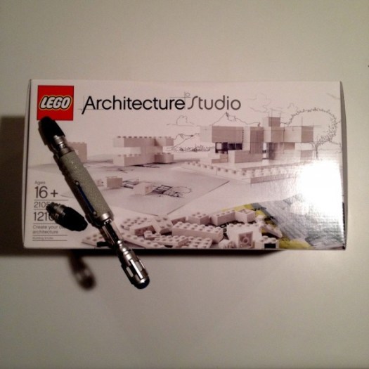
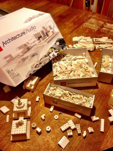
I watched Liam puts Legos together today. He bought me the new architecture studio Lego set for my birthday, mainly because he is awesome, and partly because I might have asked for it, regardless…
Today, he put the Legos together with a look of pure joy in his eyes. He was enjoying the process. He was ecstatic, thinking about the possibilities.
I was jealous.
Do you remember that feeling?
It’s been a while, but, somewhere under all this angst and disappointment and misinterpretation and compromise… somewhere…,deep under there is a nine-year-old thinking about the endless possibilities and imagining what would happen if I just tried this,
one,
simple,
impossible,
irrational,
improbable,
piece in just this one perfect place.
Until I look at it and realize that it would be even better if that piece wasn’t there, and no. It would be much better if that piece was a giant, or a mouse, or a giant mouse, or a giant robotic, cartoon mouse.
With a chainsaw.
And my eyes would get wide as I imagine the tightrope that I could walk over, not at all carefully, over this pit of fire, and monster trucks, and cupcakes, to get to the other side where the answers are, or where they aren’t, or where they never really were anyway, or whatever. But, I assume there will be cookies and greatness.
Do you remember how awesome that feeling was?
I should find that again.
Who’s with me?
J
Evil Lairs
New plan.
From now on I will ONLY design evil lairs. Because all the best architecture is designed for the evil.
My work will have moats, and concrete, and glass and steel. I will design 16-story one-bedroom homes, with helipads, and lots of electronics. There will be a retractable roof, maybe lasers.
I will completely ignore the building code, because you know “evil”. Building codes are for the common people. Not for the evil.
The stairs will have no railings. None. Screw OSHA. Falling from the stair into the reflecting pool is just my way of thinning out the weak. The risers will be open too. Watch your shins.
There will be an improbable cantilever, probably over the side of a cliff. My enemies will dangle there while I stand on their fingers and laugh maniacally. The rock below will be jagged and unforgiving. You could scream of course, but obviously this lair will be remote. No one is going to hear you. Oh, was there a 42″ guard rail next to the cliff edge? Of course there wasn’t.
The lair will be clad in reflective glass, arranged in a precise semi-circle. At exactly 12:45 on the summer equinox, this form will focus the sun’s rays and intensify them, melting you and your passing Jaguar XJR. Somewhere in Uruaguay, Rafael Vinoly will receive a call on a burner cell. “it’s done” I will say.
My lair will dissolve the separation between the inside and the outside, by using acid.
The view from my lair will be breath-taking. Literally.
It will be vast, open, and sparingly furnished. And grossly over budget. It will be financed out of several Swiss bank accounts from various shell companies. The real money will be coming from the cartel. I will write “glazing” in the memo section of all of the checks. The off-shore banks will know what this means.
There will be a large safe in the master closet, covered by a rare Mondrian print. Within the safe will be a leather case with $250,000, a pistol, and a black and white photograph of Le Corbusier, naked, with a large scar on his leg.
I will live here alone.
The design of the lair will be featured on the cover of the August 2014 issue of Architecture magazine.
Daniel Libeskind will see this, then slowly rise and move towards the master closet. He will remove the Mondrian print, and open the safe. Inside the safe will be a small remote control with a flashing red button. Libeskind will press the button, with the slightest hint of a smile crossing his face.
And it will begin.
.
photos have been used under the creative commons license ( HERE & HERE)
Design means doing what I say
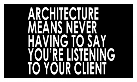 Occasionally I read an article that I completely agree with. I nod my head, check an imaginary box somewhere in my cerebellum that’s labeled “see what I mean” and retweet that article. This article actually: “Great design = getting people to do what you want.”, by Seth Godin
Then I go to bed. At 2:32 am, I wake up and think “wait, …. do I?”
I read Seth’s article. And found myself convinced. I believed (because I wanted to believe) that my efforts as a designer are spent trying to get the client to want the things that I think they should want. After all, I have years of experience in this, and I’ve probably approached the clients particular design challenge in a hundred different ways over the years. I’ve probably learned to avoid a few problems and pitfalls that lie along the path that this particular client is walking down. I can be a good guide for them, pointing out where the cracks are in their plans, warning them of the mistakes that they are about to make. They should trust me right? Isn’t that why they hired me? Aren’t they expecting to benefit from my expertise? Because:
Great design is pushing/focusing the user to do something that he’ll thank you for later.
- Seth Godin
Is it my role as a designer to find a way to make the client want what I want them to want? What I believe is right? Am I supposed to be designing for what’s best for the project,site,community,etc. and just assume that the client will thank me for it later?
But then the alternate seems less appealing as well. Am I only here to “draw up” what the client wants to build? Do I just assemble the documents needed to get through the process and leave my opinions out of it? Am I just a filter for the clients ideas? Is that what all those firms who label themselves “service” firms are trying to do? Was I hired to “write” down everything you’re saying no matter how much it makes my heart hurt? If you already know what you want and you’re just looking for someone to put it onto paper, why do you need an architect? Or as Frank Gehry not so eloquently put it:
I don’t know why people hire architects and then tell them what to do.
- Frank Gehry
Apparently, Frank doesn’t need to be nice to get clients anymore.
.
I hear both sides of this argument again and again from architects.
- “We should provide a service to help our client navigate the process.”
- “We should find creative solutions to complex problems.”
To be honest, I’m getting tired of the argument. Are we creative artists? Or are we simply providing a service? There are only 2 people that fit those two molds. One is an pompous jerk, and the other is so dull I want to poke my eyes out with the mechanical pencil in their shirt pocket.
There’s a middle ground that’s much more effective, and it’s the space that most of us work in everyday. We listen to what the clients aspires to, we get excited about the potential, we share our experiences with similar aspirations, we warn of the possible risks involved in these aspirations, we notice the limitations of the initial idea and point out ways to expand it and build on it, we get excited about that possibility, we get you excited about that possibility, you worry about drifting too far away from what you had in mind, we hear that, but we can’t let go of the possibility of something awesome, we plead our case for it, you’re swayed a bit, reluctantly, so we try it out, we like some of it, we see the excesses of some of it, we rethink it, we compromise, we try again, we get excited again, we search for what we’re looking for, and at some point we forget who’s idea was who’s and we just look at the problem at hand, we solve, we imagine, we create, we build.
At some point the distinction between the “right” thing to do and that thing that you “told me” to do falls away, and we start talking about the thing that we ARE doing. We start saying “we” instead of “me”, and “I” and “you”. Because, that’s what great design really is:
Great design is getting to a place where WE (designer and the client) are creating the same thing, together.
Who’s an Architect? Doctor Who
I’m going to step right out on a limb and just go ahead and say what we’ve all been thinking. Doctor Who… is TOTALLY an Architect.
Don’t believe me? Well, I’ve been reviewing the evidence (mostly on Netflix, but somewhat on BBC America) and I think I’m on pretty solid ground with this theory. Although I’m still on season 7, so…maybe things will change in season 8. Maybe they’ll replace the current Doctor with a gruff melancholy overly thin and haggard white guy with an accent and visions of grandeur and a chip on his shoulder, which, actually, would also be a very Architect-y thing to do. Does Peter Capaldi have male pattern baldness? No… well… maybe he’ll ditch the bowtie for black-rimmed round glasses. *fingers-crossed*
Either way,
DOCTOR WHO? TOTALLY an Architect.
Well, I can come up with at least 9 examples of the similarities:
ARCHITECTS (and Doctor Who) DO TRAVEL IN SPACE AND TIME: Travelling in space and time? Isn’t that what architecture is really? Marking a point in space and time? Designing, imagining, and building something that joins the continuously flowing stream of space and time? Aren’t we architects simply visiting this point in time? Bringing our own personality and talents and passions to play for a brief moment and then throwing the results into the vortex of time itself? Of course we are. Dropping into society with our fancy blue boxes, willy-nilly, and darting away without a trace. Except for that crack that we may or may not have caused in the space time continuum with that whole “Bauhaus movement”. But still… err, I mean DeStijl.
ARCHITECTS (and Doctor Who) NEED COMPANIONS: Architecture is team sport. You are not going to create this rift in space and time by yourself. Well, you could actually do it alone, but Time Lords don’t do very well on their own. They can get all judgmental and egomaniacal and it’s really not as good when Architects go it alone either, mostly for the same reasons. Things tend to get esoteric and self-referential and all cold and pointy and glassy and distant and I’m looking at you Daniel Libeskind. Architects need to work together to pull this off, because it’s complicated. Maybe overly complicated, granted, but if we work as a tight-knit group of ragtag adventurers along this grand endeavor, we may be able to achieve something amazing. Plus, if the Architects team/”companions” happen to have the right mix of compassion and humanity and creative thinking, “We” may just be able to create something that truly represent our humanity. Architects are not going to do this all alone. Basically, what I’m saying is: Architects need interns.
BOWTIES ARE COOL: As are scarfs, long coats, and anything tweed, and hats… oh, wait. I’m pretty sure Frank Lloyd Wright is Doctor Who. Maybe he was the 4th Doctor, and, Mies Van Der Rohe was probably the 5th, because I think Philip Johnson was his “companion”. And obviously Robert Venturi was a Doctor. I mean, with all that tweed coat and vest wearing English museum addition building he did while his “wife” Denise “River-Song” Scott Brown called him “Sweetie” and told him how to drive the Tardis/post-modern-steam-punk-design machine. And, obviously, Robert “Rory” A.M. Stern is a plastic Roman. This is really all just science.
ARCHITECTS (and Doctor Who) WILL ALWAYS HAVE A PLAN: Well, not a plan really. Actually, we are totally making this up as we go. We’re waving our arms around, spouting out technical mumbo-jumbo that nobody else understands, while we pull on these odd looking levers and push buttons on our fancy Revit machines while shaking our weird looking sonic/pen/eraser/screw-driver thingy over the onion skin papers in front of the client. We just drew that upside-down. Impressive wasn’t it? Yes. We just totally made that up.
I THINK CLIENTS ARE WEEPING ANGELS: The entire time we present to the client, we’re looking right at them. We’re telling them about the benefits of the design and the intricacies of our brilliant disruption of space and time, that the client is going to be able to pay for, and we we’re pretty sure they were loving the design concept. They were just standing there, looking angelic and solid, so we assumed that they were impressed, so, we left to go back the office feeling optimistic, but, just when we stopped looking at them, they moved, really fast, and talked amongst themselves and decided to go a completely different way. When we get back to the office there’s a message on the machine. They want to make some changes, and then we’re stuck designing something that looks like it belongs in a 1960s strip mall or a Roman Forum (maybe both), while our client stands over our shoulders, covering their eyes with their hands. Please remember this Architects, whatever you do, keep looking at the client. Don’t Blink.
ARCHITECTS ARE NOT GOING TO BE HELD BACK BY SOMETHING AS TRIVIAL AS THE RULES OF PHYSICS: Architecture, and time-travel, requires a willful suspension of disbelief. Can we cantilever this office wing over that crevasse? Of course we can. Gravity is more of a guideline really. If the “story” requires that we ignore a few details like science, so be it.
ARCHITECTS (and Doctor Who) WILL BE WORKING ON CHRISTMAS. Always, holidays mean nothing to Time Lords, or Architects. Nothing. Someone has to take care of these waterproofing details, I mean, Daleks…. Same thing.
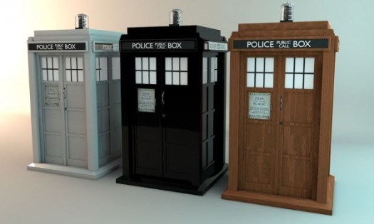
ARCHITECTURE IS LARGER THAN IT APPEARS ON THE OUTSIDE. It is so spacious in there. It’s all open and flowing space, plus, it has a swimming pool. It’s next to the library. My thesis project in school was a redesign of the Tardis. I removed most of the detailing on the exterior and painted it white. I plan to go back and finish it someday. Maybe next season. It will also have more glass.
BASICALLY ARCHITECTS (and Doctor Who) ARE JUST A MADMAN IN BOX.
Plus, I’m pretty sure this guy was in my design studio in architecture school:
So, remember this the next time you and your companions start to work on a project, the very fate of the universe could depend on your actions. Or, maybe this is just an office renovation. Although, it is an office renovation that is due tomorrow, and at this point your only chance of meeting the deadline may involve time travel..
Or,
Maybe, it is just an office renovation,
Somewhere.
In space and time.
The tardis photo is from timhoggarth’s photostream on Flickr and has been used under the creative commons license.
The Frank Lloyd photo was found HERE
I found the David Tennant waving GIF HERE
I may have misunderstood what Mies van der Rohe was saying
Mies van der Rohe comes to me at night and yells at me.
I think it’s Mies van der Rohe. Although, he does look a little like my grandfather, and he smells like steel and optimism.
Anyway, this is what he yells at me. At least I think it is, but, I may have misunderstood him, possibly. I wasn’t really listening.
Well, actually, I was listening “less”.
And also, I was hiding under my bed, next to Philip Johnson.
He smells like wine.
I miss my Grandfather.
.
.
.
.
.
.
.
I may never sleep again.

