<figure>
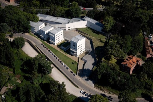
This week we present the Faculty of Architecture of the University of Porto through the lenses of Fernando Guerra. Here we share a complete series from the photographer of this iconic work, along with a brief text on the subject. The University of Porto plays a major role in the world's architectural landscape, always among the highest in rankings and boasting great architects like Eduardo Souto de Moura (Pritzker 2011), Fernando Távora and Álvaro Siza Vieira (Pritzker 1992).
Built between 1985 and 1996 by the Portuguese architect Álvaro Siza, a former student of the school, the work consists of 10 different volumes, each one with its own unique personality, but which find a common identity through color, opacity and constructive solutions.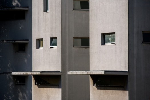
The school's original program included classroom facilities for 500 students, an auditorium, administration, an exhibition hall and a library. The architect decided to split this program into separate buildings.
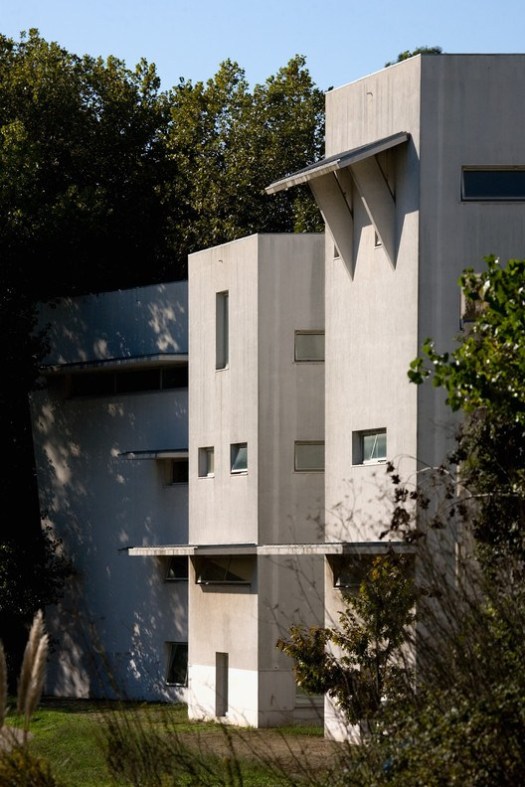
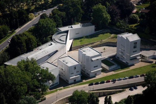
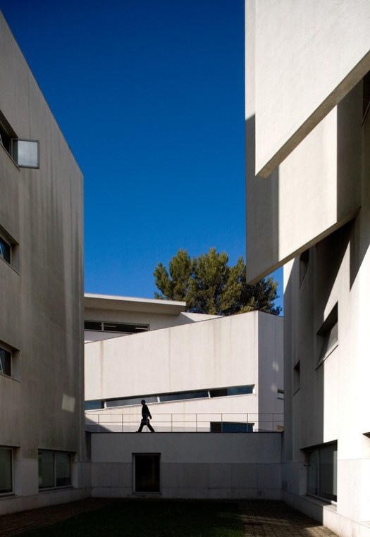
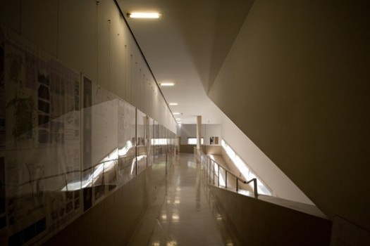
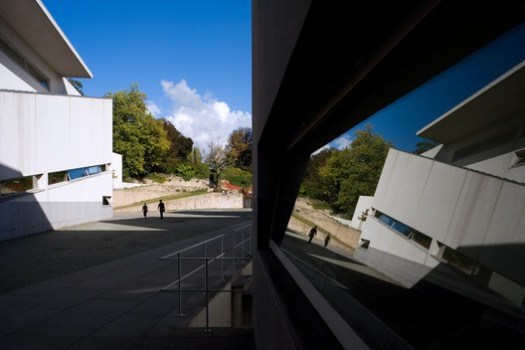


Four towers are lined up along the river. On the other side of the terrain, however, two laminated buildings connected by a semi-circle take center stage. In the middle of the lot, there’s a large irregular, almost triangular patio. Interestingly, the courtyard is reminiscent of the shape of the first pavilion on the campus built by Siza, still close to the historic building, featuring a U-shape with slightly closed arms. The work plays quite a bit with right and oblique angles, especially in the desired visuals and proportions. In the northern part of the grounds, the linear volumes are more opaque, where Siza has implemented the most common features, which are the auditorium, the exhibition hall, the library, as well as the administrative part, closer to the nearby road.

Knowing that much of the interaction and learning was not taking place in classrooms and libraries, but more in the in-between spaces, patios, and cafes, the architect paid great attention to them. He designed the college like a small town, taking advantage of the unevenness of the terrain to create more social, wider spaces, and more intimate spaces. Walkways and ramps connecting levels and classes are laid out like streets, and the cafe and courtyard like plazas and parks.


La Facultad de Arquitectura de la Universidad de Porto (Alvaro Siza)- Arquitecturas (2001). Director: Richard Copans.
<img src="http://feeds.feedburner.com/~r/ArchDaily/~4/wREb1dtdpNI" height="1" width="1" alt=""/>
