Today’s archidose #961

Here are photos of a couple buildings in France’s Bourgogne-Franche-Comté region photographed by Wojtek Gurak.

Conservatoire Henri Dutilleux (2015) in Belfort by Dominique Coulon & Associés:


Monastery of St. Clare (2011) in Ronchamp by Renzo Piano Building Workshop:


To contribute your Flickr images for consideration, just:

:: Join and add photos to the archidose pool

To contribute your Instagram images for consideration, just:

:: Tag your photos #archidose

from A Daily Dose of Architecture http://ift.tt/2pCf3Uu
via IFTTT

Diane Lewis, 1951-2017


[Studiolo by Diane Lewis Architect | Image source]

Yesterday architect and educator Diane Lewis died at the age of 65. She was known more for her decades of teaching at The Cooper Union, from where she graduated in 1976, than her New York practice. I reviewed books on both ends of her architectural life: Inside-Out, a monograph published in 2006; and Open City: Existential Urbanity, a large-format book on the “Architecture of the City” studio at Cooper Union that came out in 2015. My review of the latter resulted in me meeting Lewis and participating in an event celebrating the book. I was impressed by her intellect, passion and generosity. These and other sentiments are echoed in Dean Nader Tehrani’s In Memoriam piece on The Cooper Union’s website and Suzanne Stephens’ obituary at Architectural Record.


[Studiolo by Diane Lewis Architect | Image source]

Lewis built very little and what was built was limited (as far as I know) to NYC interiors. The best resource for these projects is the Cooper Hewitt, which named Lewis a finalist in the 2008 National Design Awards in the Interior Design category. A couple of works found on the Cooper Hewitt website are featured here. At top is Studiolo, the name for the loft of architecture’s married couple, Beatriz Colomina and Mark Wigley. And below is an atelier she designed for a curator. Both exhibit her background at Richard Meier’s and I.M. Pei’s offices (she worked for them before starting her own practice in 1983) as well as her own skill as an architect. I always wished one of the buildings Lewis designed would find its way to realization (her proposal for Astor Place was a favorite). Although her death would seem to put an end to that thought, maybe, like her mentor John Hejduk, it will happen someday.


[Camera Cohen by Diane Lewis Architect | Image source]

from A Daily Dose of Architecture http://ift.tt/2pa3xwU
via IFTTT

A Brass Front – and Sides

Yesterday I got an email with the 2017 winners of the North American Copper in Architecture Awards. Of the fifteen projects, the one at 210 Pacific Street in Brooklyn stood out the most, so I hopped on the G Train to check it out in person.

Although not credited on the awards web page nor featured on their own website, numerous sources indicate that SBLM designed the residential project.

The award-winning feature is the 120-foot-tall facade, which is covered in “15,000 individual pieces of pressed brass tiles 80/20 in 0.02 inch thickness,” per the awards web page.

Furthermore, “the individual brass pieces in two different sizes … are fastened to 8,000 feet of stainless steel vented track system and steel tracks supporting ventilation, and custom pieces were made to fit around corners.”

One of the most striking aspects of the facade is the way it wraps the sides of the building, unlike old stone fronts that turn into brick on the sides. The developer must have bought some air rights from its neighbors, given this feature and the windows located on the side elevations.

The building wrapped up some time last year, but in that short amount of time the brass facade has subdued considerably, at least when my photos are compared with those at Pardon Me For Asking, which documented the construction in early 2016.

Numerous stories highlight the Passive House aspects of the design, meaning something green hides behind the brass fronts and sides.

from A Daily Dose of Architecture http://ift.tt/2pTO5ZZ
via IFTTT

Today’s archidose #960

Here are some photos of The Box Office (2010) in Providence, Rhode Island, by Truth Box Inc.. (Photographs: Hassan Bagheri)


To contribute your Flickr images for consideration, just:

:: Join and add photos to the archidose pool

To contribute your Instagram images for consideration, just:

:: Tag your photos #archidose

from A Daily Dose of Architecture http://ift.tt/2py1sfh
via IFTTT

Book Review: MCHAP Book One

MCHAP Book One: The Americas edited by Fabrizio Gallanti
IITAC Press/Actar, 2016
Hardcover, 444 pages

In October 2014 the Illinois Institute of Technology (IIT) announced the winners of the inaugural Mies Crown Hall Americas Prize (MCHAP), with Álvaro Siza’s Iberê Camargo Foundation in Porto Alegre, Brazil, winning for 2000-2008 and Herzog & de Meuron’s 1111 Lincoln Road in Miami Beach, Florida, winning for 2009-2013. By the time this book documenting the prize and its seven finalists came out last year, the winner of the 2014-15 MCHAP was already announced: SANAA’s Grace Farms in New Canaan, Connecticut. MCHAP recognizes the best building realized in the previous two-year period (minus the inaugural) in North and South America, such that it functions like an Americas equivalent of the EU Prize – Mies Award.

Even though it documents the winners and finalists, this book isn’t really about them. This is clear from the introductory essays, by Dutch architect and IIT dean Wiel Arets and editor Fabrizio Gallanti. The former is about cities and technological developments on the two continents and “the creation of a new dream,” while the latter explores the fluid ideas and meanings of “America” – nary a mention of the prize is found. Furthermore, if one were to read the book from cover to cover, they wouldn’t learn which projects won until page 417. Between the introduction and back matter, with its listing of the winners, finalists, outstanding, and nominees, are seven chapters thematically organized around the seven finalists. Herzog & de Meuron’s Florida parking garage sets up the theme of mobility and infrastructure, for instance, and Siza’s project is the spark for exploring “the role of travel and cultural exchange for designers,” per Gallanti’s essay.

Each of the seven chapters is structured the same way across roughly fifty pages: a short introduction, a long essay, photos of the finalist and an interview with the architect, and an “anthology” of articles, essays, photo essays, and book excerpts related to the theme. With this structure, there’s no need to read the book cover to cover – or all of it for that matter. Instead, people can dip into projects or themes that are of interest, taking in lessons both new and old that paint a picture of the evolving Americas. It’s a tactic that is more rewarding than a straightforward presentation of the MCHAP finalists, though there is one omission that hopefully future editions will balance out: Canada. The United States, Latin America, and South America are well represented in the projects, contributions, and anthologies, but there’s very little touching on our overlooked neighbor to the north.

from A Daily Dose of Architecture http://ift.tt/2oEKmiB
via IFTTT

Today’s archidose #959: I.M. Pei

Today is I.M. Pei’s 100th birthday, so I’ve rummaged through the archidose Flickr pool to find a sampling of some of his buildings, listed in chronological order. Mouse over and/or click on images for photographer information.

Jefferson Hall Conference Center, University of Hawaii, Honolulu, 1963:
Jefferson Hall Conference Center

University Village, New York University, New York, 1966:
Silver Towers

Sculpture Wing of the Des Moines Art Center, Des Moines, IA, 1968:

Cleo Rogers Memorial Library, Columbus, Indiana, 1969:

East Building, National Gallery of Art, Washington, DC, 1978:
National Gallery of Art - I M Pei

John F. Kennedy Library, Boston, 1979:
JFK Museum

Le Grande Louvre, Paris, 1989:
l'automne 2005
The same, photographed in 2016 when street artist JR made Pei’s glass pyramid “disappear”:
Untitled

Bank of China Tower, Hong Kong, 1990:
Bank Of China

Rock and Roll Hall of Fame, Cleveland, OH, 1995:
Rock and Roll Hall of Fame and Museum (1995)

Miho Museum, Shiga, Japan, 1997:
ミホミュージアム, 滋賀県, Miho Museum, Shiga, Japan

Extension to the Deutsches Historisches Museum, Berlin, 2003:
Deutsches Historisches Museum, Berlin, Alemanha

MUDAM-Musée d’Art Moderne Grand-Duc Jean, Luxembourg, 2006:
Mudam Luxembourg - Musée d’Art Moderne Grand-Duc Jean

Suzhou Museum, Suzhou, China, 2006:
Suzhou Museum by I.M. Pei

The Museum of Islamic Art, Doha, Qatar, 2014:
The Museum Of Islamic Art

To contribute your Flickr images for consideration, just:

:: Join and add photos to the archidose pool

To contribute your Instagram images for consideration, just:

:: Tag your photos #archidose

from A Daily Dose of Architecture http://ift.tt/2ow3vTP
via IFTTT

Today’s archidose #958

Here are some photos of La Seine Musicale (2017) in Boulogne-Billancourt, France, by Shigeru Ban Architects and Jean de Gastines Architectes. (Photographs: JP2H)


To contribute your Flickr images for consideration, just:

:: Join and add photos to the archidose pool

To contribute your Instagram images for consideration, just:

:: Tag your photos #archidose

from A Daily Dose of Architecture http://ift.tt/2osIycN
via IFTTT

Book Review: Two Monographs

Renzo Piano: The Complete Logbook by Renzo Piano
Thames and Hudson, 2017
Hardcover, 420 pages

This Building Likes Me: The Work of John Wardle Architects by John Wardle Architects
Thames and Hudson, 2016
Hardcover, 440 pages

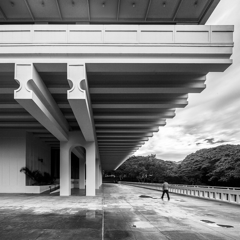
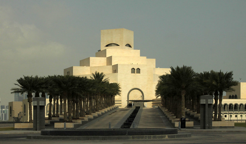
The cover of the updated version of Renzo Piano’s Logbook is appropriate, since the architect’s sketches are as singular and distinctive as his buildings. Although I’m not certain which project the sketch represents, the inclusion of a sailing boat says as much about Piano as the building’s waterfront site. Among the more than 70 projects included in the Logbook are the sailing boats Piano designed from 1960 to 2007. A reflection of his love of sailing, the boats were also a means of testing out materials and ideas that would be applied to buildings. It would be hard to have an office sited on a hillside overlooking the Mediterranean (photo below) and not carry on a love with the water.


[Punta Nave, Genoa, Italy, 1991 | Photo: Fregoso & Basalto, courtesy of Thames & Hudson]

I never had a copy of the first Logbook, which was published in 1997, so I can’t compare the two, but for fans of the Renzo Piano Building Workshop, like me, the book is sure to be a delight. In some ways it functions like a smaller version of the multi-volume “Complete Works” authored by Peter Buchanan (I have volume 4, so I can make something of a comparison), most notably in how some projects are presented in detail and all of them include numerous types of illustrations (drawings, models, materials, construction), not just photos of the completed buildings. But Logbook is all Piano’s words, so reading it is like having a conversation with the architect, whose humbleness and collaborative nature is reflected in the preference for “we” over “I” and of course in the name of his firm.


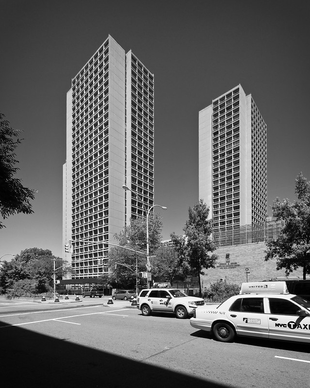
[The Whitney Museum of American Art, New York City, 2015 | Photo: Nic Lehoux, courtesy of Thames & Hudson]

The 70-odd RPBW projects span from his “early works” in the 1960s to such buildings as the Whitney Museum of American Art that opened a couple years ago. They are presented chronologically by start date, so the book includes long-range projects like Columbia’s Manhattanville Campus that are only partially done. All of the projects are built to some degree, but the Logbook also includes a list of in-progress projects (so many) as well as a complete list of works that goes beyond those presented. Other pieces of back matter include information on the workshop, a biography on Piano and his partners, a team photo, and a selected bibliography – an invitation to read even more about Piano and his buildings.


[Spread from This Building Likes Me | Image source]

The previous monograph on Australia’s John Wardle Architects was Volume, which came out in 2009 and which I reviewed on this blog. That book’s strong focus on process, its rich layering of information, and overall high level of quality continue with This Building Likes Me, what has to be one of the most refreshing names for an architectural monograph, at least since Simon Velez’s Grow Your Own House. The name of JWA’s latest book hints at a couple things: the way their buildings are designed to work well from a user’s perspective and the way the architects work with their clients to produce the best possible outcomes. The fruits of their efforts are illustrated in fourteen carefully presented projects and an even larger number of essays (both written and photographed) by those within and outside of the now 30-year-old firm.


[Spread from This Building Likes Me | Image source]

The firm’s most well known building – one produced since Volume – is certainly the Melbourne School of Design, a collaboration with Boston’s NADAAA that was completed in 2014. The pairing was not a design architect looking for a local architect, as is the case in so many design competitions and international commissions; it was, in the words of MSD dean Andrew Hutson in his essay, “Competing Interests,” a “true partnership.” The project’s paired structure also finds a parallel in the way the monograph is laid out (done with editor Justine Clark): Projects are presented in pairs rather than individually. One might think then that MSD would be paired with a project like JWA’s earlier Melbourne Grammar School, given the geographical and typological overlaps. Instead, it’s the Bruny Island “Making” Projects, which are “a series of projects designed and partly constructed by people within the practice while working with local carpenters, stonemasons and farmers.” So collaboration is the common theme in this pair, and it is one of the most important aspects of JWA’s success, evident in their reciprocally “likable” buildings.

from A Daily Dose of Architecture http://ift.tt/2ooomIH
via IFTTT

World Book Day

Today is World Book Day, or what is officially known as World Book and Copyright Day, started in 1995 by UNESCO. Although there doesn’t appear too much in the way of celebrating this day – unlike, understandably so, yesterday’s Earth Day – I figured I’d share a photo of the books I’ve been reading this weekend, all related to New York City; specifically, they are focused on the areas of my architectural walking tours this season: the High Line, Columbia University, and 57th Street.

from A Daily Dose of Architecture http://ift.tt/2q4qXUK
via IFTTT

Auditing POPS

I’ve been infatuated with POPS (privately owned public spaces) since at least early 2008, when I read and reviewed Kristine F. Miller’s Designs on the Public. One chapter in her book is all about three adjacent, contemporaneous POPS from around 1983: the AT&T Building (Sony Tower), the IBM Building (590 Madison Avenue), and Trump Tower, the last of which has four such spaces (a covered pedestrian space, a passageway to 590 Madison, and two landscaped terraces. Other POPS posts on this blog looked at 100 William Street and 33 Maiden Lane in Lower Manhattan and The Galleria on 57th Street.

A POPS is, per the great APOPS website, “a plaza, arcade, or other outdoor or indoor space provided for public use by a private office or residential building owner in return for a zoning concession.” Or as the office of NYC Comptroller Scott M. Stringer puts it in their audit that was released a couple days ago, “Currently property owners are benefiting financially from approximately 23 million square feet of additional (bonus) floor area in their buildings in exchange for providing POPS at 333 locations in New York City.” But is the public benefiting? Not really, according to the audit, which states that “more than half (182 of the 333) failed to provide required public amenities.”

One of these failures is an all-out removal of a POPS, at 410 East 58th Street. The hotel/residential project from 1974 included a narrow finger of space connecting the tower to 57th Street, but even in 2000, when Jerold Kayden published Privately Owned Public Space: The New York City Experience, the required POPS was “occupied by a single-story, permanent, private entrance structure called a greenhouse.” This space – or is it a non-space now? – is near the start of my upcoming “57th Street, River to River” architectural walking tour, and I’ll admit that my research has revealed that so much about the tall buildings built along what has become known as Billionaire’s Row concerns POPS and, more recently, air rights swaps.

Even though the audit reveals POPS are far from perfect, at least they provide something for the public, unlike air rights swaps, which are created in private and lead to supertall towers built as-of-right, without the need to give the public any usable space. The city is powerless to do anything about these recent transactions, but at least it’s finally doing something about POPS. Though it remains to be seen if developers and building owners will undo the neglect of the privately owned public spaces that enabled them to build higher and make more money.

Click the cover to read the “Audit Report on the City’s Oversight over Privately Owned Public Spaces” (PDF):

from A Daily Dose of Architecture http://ift.tt/2q01mwb
via IFTTT

Kenneth Frampton on Global Architectural History


[Editions of Kenneth Frampton’s Modern Architecture: A Critical History in multiple languages | Image via CCA]

The Canadian Centre for Architecture has just posted a video of a conversation held at the CCA on April 6: “A Conversation with Kenneth Frampton: Can There Be a Global History Today?” The event consisted of a roughly half-hour talk by Frampton, followed by talks by Cornell’s Esra Akcan and MIT’s Mark Jarzombek, and then a roundtable discussion with the trio moderated by the CCA’s Kim Förster. Frampton’s talk is from the beginning to the 36:45 mark, while the discussion starts at 1:22:22.

As the top image from the CCA’s page for the event shows, Frampton is still best known for his Modern Architecture: A Critical History, which was first published in 1980, has been updated three times since and, according to his comments, will be updated one more time. But when it came time for me to write my own (lite) version of a global architecture history – 100 Years, 100 Buildings – another Frampton publication was even more helpful.

I’m referring to the ten-volume World Architecture 1900-2000 – A Critical Mosaic, which was put out by the China Architecture & Building Press with Springer Verlag in 2002, and for which Frampton served as general editor. Each regional volume (Latin America, United States and Canada, Mediterranean Basin, etc.) presents 100 canonical built works selected and written about by well known historians and critics. It’s an amazing collection of 1,000 buildings but one I didn’t know about until researching for my book a couple years ago. Why is that?

Frampton answers this in his talk, during some comments (starting at the 5-minute mark) about the ten-volume “magnum opus.” At the 7-minute mark he says:

One of the strangest things about this ten-volume encyclopedic survey is that it has been so badly distributed you can almost not find it anywhere. I don’t quite know why the China Architecture & Building Press, after all this effort, should fail in this particular sector.

I can concur. I was able to cobble together six of the books, most on Amazon and most for not too much money. But others are hard to find even online and therefore cost an unreasonable amount. No wonder Frampton’s other books continue to be more influential, even though they are not nearly as exhaustive as World Architecture 1900-2000.

from A Daily Dose of Architecture http://ift.tt/2oTOcS3
via IFTTT

Apple’s Almost Done

According to the drone footage embedded at the bottom of this post,

Apple Park is the official name for the company’s 175-acre headquarters in Cupertino, California, what was previously referred to as Apple Campus 2.0 and “The Spaceship.” The last time I posted about Norman Foster’s design was about a year ago, in regards to the 10-1/2-foot-tall by 46-foot-long panels of curved glass, a huge engineering feat. At that time there were also reports about “two glass doors that span four stories high,” but no images. The latest drone footage reveals what appears to be those doors, found at the 2:30 mark in the below video:

The April 2017 drone footage of Apple Park:

from A Daily Dose of Architecture http://ift.tt/2pD9zXJ
via IFTTT

Today’s archidose #957

Here are some photos of Chi She (2016) in Shanghai, China, by Archi-Union Architects, featuring a robotic-built brick wall by Fab-Union Intelligent Engineering. (Photographs: Trevor Patt)


To contribute your Flickr images for consideration, just:

:: Join and add photos to the archidose pool

To contribute your Instagram images for consideration, just:

:: Tag your photos #archidose

from A Daily Dose of Architecture http://ift.tt/2oIPJua
via IFTTT

Book Review: The Rule of Logistics

The Rule of Logistics: Walmart and the Architecture of Fulfillment by Jesse LeCavalier
University of Minnesota Press, 2016
Paperback, 282 pages

Think about Walmart and most likely architecture does not spring to mind. The company Sam Walton started in Arkansas in the 1960s became the world’s largest retailer by erecting inexpensive and efficient boxes to store and display good sold cheaper than anybody else, not by championing attention-getting architecture. Nevertheless, their Walmart stores, Supercenters, and Sam’s Clubs are instantly recognizable, and their interiors incorporate research on the benefits of natural light and other environmental factors toward getting customers to open up their pocketbooks. In other words, Walmart is well aware of the importance of architecture; it’s just executed in a manner quite distinct from capital-A architecture.

One aspect of Walmart’s physical reality is logistics, which appears to have been a passion of designer and educator Jesse LeCavalier for some time now. I first became aware of his research in 2010 when I posted “Walhattan” and a link to his essay, “All Those Numbers,” at Places Journal. A couple years later I came across his ongoing research in Cabinet Issue 47: Logistics, where his piece, “The Restlessness of Objects,” appeared. He got a fair amount of attention back then in part from a graphic showing the square footage of the various Walmart iterations next to the island of Manhattan. It drove home the scale and influence of the corporation, while also revealing some apparently insurmountable conditions for the retailer – to this day it does not have a store in Manhattan.

Yet as LeCavalier reveals in last year’s book on the role of logistics in how Walmart functions, impediments are design problems to navigate, not road blocks. Specifically I’m referring to the way the retailer lined stores along – but not inside – the Vermont border in response to the state’s ban on the company’s stores. Walmart used its logistical expertise to best position these stores to nearly saturate the market within Vermont; the same expertise was used to locate the stores that eventually got built inside Vermont once the state relented. The way Walmart handled it, Vermont had no choice but to relent, since all those dollars were being spent in New Hampshire, Massachusetts, and New York – not Vermont. Although this example will make opponents of Walmart (like me) even bigger opponents, it serves to express just how widely logistics infiltrates the corporation’s practices.

That said, there is one example of capital-A architecture in The Rule of Logistics: the Crystal Bridges Museum of American Art in Bentonville, Arkansas. Designed by Moshe Safdie for Sam Walton’s daughter, Alice, the building dramatically spans a waterway not far from the Walton house designed by Fay Jones. Yet in LeCavalier’s hands, the museum is not important in terms of form; rather he focuses on its role in creating a cultural draw, alongside the Walmart Museum, in a region that would normally be considered “flyover country.” Even with the inclusion of Safdie’s building, it’s the stores, data centers, distribution centers and other aspects of Walmart’s physical infrastructure that will stick with readers, prompting them to consider just what they mean for architecture in a broader sense.

from A Daily Dose of Architecture http://ift.tt/2pfFP5Z
via IFTTT